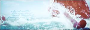
What with all the crazy amount of news we've been getting about VDT recently, it's been on my mind a lot, and since I've not seen many new VDT wallpapers, I thought I'd just make one myself!
The lyrics are from Scott Krippayne's new song, Voyage. I fell in love with this song and love how it captures VDT's spirit of adventure, which I also attempted to capture in this WP. I'd love to hear your comments and criticisms!
EDIT:
After reading Lion's Emblem and Quinlin's comments about the bottom text, I made a second version to try to make the text less distracting...
Uploaded with ImageShack.us
"Oh telescope, keep an eye on my only hope,
Lest I blink and be swept off the narrow road.
Hercules, you've got nothing to say to me,
'Cause you're not the blinding light that I need.
For He is the saving grace of the Galaxies."
Wow, great wp Dekkie. I absolutely love the coloration throughout, it's so inviting. Additional nice work here in having the same coloration and lighting on the character images match that with the light source in the BG (in terms of their layout). Overall design and layout look good. The blending of imagery is superb. The only thing that bothers me on the images is that Caspian seems to be a bit of a "floating head". Whereas with Edmund, Lucy, and Reepicheep there's the mountains or the frame of reference to help hide the fact. Maybe some slight shifitng or a different image choice would help a bit (?). For some reason, I'm really drawn to your choices of imagery for Lucy and Edmund. They just seem to be so reflective and in the moment of the piece (as if you didn't choose your imagery, but rather the imagery was made specifically for the piece). Text works really well with the imagery and the concept of the piece. I especially love how "into the sunrise" blends right into the rock formation (nice choice of font, sizing, and coloration here). It's subjective, but I would go with a more subtle color for the bottom line of text (white jumps off real strong against the other colors in the image). A great concept with superb text and imagery to match. Nice work  .
.

Sig by Dernhelm_of_Rohan
NWsis to eves_daughter & ForeverFan
Amazing! I love it! 
They should have used that as the VDT poster, actually. 
~Riella
~ Riella ![]()
That's really lovely Dekkie!  I like it a lot. The layout and your choice for the background is great because it creates a softer tone to the wallpaper. I love how you blended the characters so well into both of the background layers. It's very effective how all of them are staring out in enchantment, particularly because of the text you chose to go along with it. The words blend beautifully into the cliffs and they're subtlety add a lot the overall appearance.
As Lion's Emblem mentioned, I'm not sure if that image of Caspian works in that place, perhaps if you switched the characters around, he would blend in better. I really do like that picture of him, though.  Also, I'm not sure why, but I find Reepicheep's presence in this wallie a bit distracting...I guess maybe because he's the only creature in this piece. Then again, it might just be me.
  My only other CC, is that the text on the bottom is a bit distracting, especially since it is white. I find that it draws away from the image and really stands out. Maybe if you blended it into the background somehow, it would work wonderfully!
Overall, I think you did a lovely job with this wallpaper! 

We have nothing, if not belief.
—C.S. Lewis
Eustace + Jill, Thank you so much!  I'm nowhere near poster caliber (though your comment did make me consider making my own version of the poster!), but thanks so much for that compliment! I'm glad you like the WP.
Lion's Emblem and Quinlin, Thank you guys so much for your thoughtful comments! I understand and agree with your criticism of Caspian's head. I had tried rearranging the "heads" in a ton of different ways, but I could never come up with another way to arrange them, so I gave up and just posted the thing  . And I didn't save a copy of the WP before I flattened the image prior to adding the text *headdesk*, so I'm afraid I can't play around with it more. However, I did try to fix the bottom text, and I've posted the edited version on my original post. Does it look any better?
"Oh telescope, keep an eye on my only hope,
Lest I blink and be swept off the narrow road.
Hercules, you've got nothing to say to me,
'Cause you're not the blinding light that I need.
For He is the saving grace of the Galaxies."
I believe that the new text coloration is much improved over the first version Dekkie. It's still readable and works, but it's much less of a visual distraction now. What matters most though is that you are happy with the change (how do you feel about it?).

Sig by Dernhelm_of_Rohan
NWsis to eves_daughter & ForeverFan
I also like the new coloration much better! Thanks for suggesting it! 
"Oh telescope, keep an eye on my only hope,
Lest I blink and be swept off the narrow road.
Hercules, you've got nothing to say to me,
'Cause you're not the blinding light that I need.
For He is the saving grace of the Galaxies."
Awesome Dekkie! I love how the images blend together so well  The coloring is wonderful to
"The mountains are calling and I must go, and I will work on while I can, studying incessantly." -John Muir
"Be cunning, and full of tricks, and your people will never be destroyed." -Richard Adams, Watership Down
Gorgeous!!!  I love the picture of Lucy that you used!
  The text and colors are blended very nicely. I love it!


Long Live King Caspian & Queen Liliandil Forever!
Jill+Tirian! Let there be Jilrian!
Lovely job! I like the galaxy feeling to it, the shine, mist and spark! Very nice, you get the feeling of them all being swept up into the sunrise of promise, if you tolerate my poetic words  I like it a lot

I've seen the movie 9 times!!! (PC)
I've seen the movie 7 times!!! (VoDT) And loved it!
Proud member of the C+S club
Av & sig by me
this's so magical  I was on love with the first version.....and then the second was even better! the better placememnt of the text is a real improvment, I really love this wallpaper!

Grief for the movies made me abandon narniaweb...but I'm so glad to be back!
Many thanks to the wonderful Lady Eowyn for making my sig/av.
Wow! Thank you so much wolfloversk, DamselJillPoll, Beginte (your "poetic words" make me giggle  ), and RoseRed! I appreciate your comments and encouragement a great deal!
"Oh telescope, keep an eye on my only hope,
Lest I blink and be swept off the narrow road.
Hercules, you've got nothing to say to me,
'Cause you're not the blinding light that I need.
For He is the saving grace of the Galaxies."
Wow, very nice blending. Yes the words are easy enough to see. And I like the coors they really work together.

signature by Beginte


