Tutorial #65 - This: ![]() to this:
to this: ![]() recreating this:
recreating this: ![]() using Gimp. Translatable.
using Gimp. Translatable.
Requested by lover of narnia.
Open and prep image/base (crop, scale, etc.). I'm using a base by don't be so base.
Go to Colors>Auto, and select White Balance.
Desaturate your image (Colors>Desaturate. I selected the Luminosity option.).
Go to Colors>Levels, and enter these settings...
Value: (input) 0, .76, 255. (output) 10, 255.
Red: (input) 26, 1.2, 255. (output) 11, 231.
Green: (input) 0, 1, 255. (output) 0, 245.
Blue: (input) 0, 1, 255. (output) 0, 255.
Desaturate the base again.
Go to Colors>Curves. Input these settings for Value...
Point 1: x = 123, y = 134 | Point 2: x = 151, y = 168.
Add a fill layer of color #dcedf6, set it to Burn at 10%.
Go to Filters>Enhance>Sharpen, and sharpen the image to your liking.
I selected the Blur/Sharpen tool, and selectively blurred and sharpened her face and eyes.
It now looks like this: ![]()
Add this:  set it to Lighten Only at 35%.
Add this:  set it to Lighten Only at 15%.
Add this:  set it to Lighten Only at 25%.
Add this:  set it to Lighten Only at 10%.
I added the text after this layer. Set it to Grain Merge at 100%.
Add this:  set it to Soft Light at 100%.
Add this:  set it to Lighten Only at 25%.
Add this:  set it to Lighten Only at 50%.
Flatten the image.
To get the tear effect, I selected the Dodge/Burn tool and selected the Burn and Midtones options.
Now, 'draw' the tear down her cheek by using a very small brush.
Select the Blur/Sharpen tool and select the Sharpen option. Go over the tear a few times to make it stand out more (do it a bit more at the bottom of the tear).
Add a 1 pixel wide frame.
It now looks like this: ![]()
You're done!
Please do not copy exactly.
--- flambeau
President of the Manalive Conspiracy
Founder of Team Hoodie
Icon by me
Tutorial #48—Black and White with a Touch of Color
Made in PSPX
Requested by fornarniaandaslan
Going from this:  to this:
PM me if you have any questions!
~Wunder

"The task of the modern educator is not to cut down jungles but to irrigate deserts." ~ C. S. Lewis, The Abolition of Man
Forum 1.0: 1303 posts
WC: 69
Tutorial #2:
Going from this:  to this:
See it here.
Dear days of old, with the faces in the firelight,
Kind folks of old, you come again no more.
(Robert Louis Stevenson)
Tutorial #66 - This: ![]() to this:
to this: ![]() using Gimp. Translatable.
using Gimp. Translatable.
I liked the end result... and Much and Eve were too cute to pass up! 
Open and prep image/base (crop, scale, etc.).
Duplicate your base layer and set it to Screen at 100%. Merge it down.
Duplicate that layer and set it to Soft Light at 65%.
Add a fill layer of color #f00d0d, set it to Screen at 5%.
Add a fill layer of color #dcedf6, set it to Soft Light at 100%.
Add a fill layer of color #dcedf6, set it to Soft Light at 100%. Add a layer mask, copy (Ctrl+c) and paste (Ctrl+v) the background layer into the layer mask. Now invert (Colors>Invert) the layer mask.
Add a fill layer of color #dcedf6, set it to Burn at 50%.
Add a fill layer of color #fff0c8, set it to Burn at 50%.
Flatten your image.
Duplicate the base layer and go to Colors>Components>Channel Mixer and input these settings...
Red channel: +120, -40, +10.
Green channel: -10, +50, +70.
Blue channel: -40, +50, +100.
Make sure that Preserve Luminosity is unchecked. Click ok. Set that layer to Soft Light at 100%. Merge it down.
Duplicate your base layer, set it to Screen at 50%. Add a layer mask, copy (Ctrl+c) and paste (Ctrl+v) the background layer into the layer mask. Now invert (Colors>Invert) the layer mask.
Duplicate your base layer, set it to Screen at 75%. Add a layer mask, copy (Ctrl+c) and paste (Ctrl+v) the background layer into the layer mask.
Flatten your image.
Add a fill layer of color #2a1409, set it to Screen at 50%.
Add a fill layer of color #2a1409, set it to Subtract at 100%.
Flatten your image.
Go to Colors>Brightness-Contrast. Set the Brightness to -15, set the Contrast to +5.
Go to Colors>Curves. Input these settings in the Value Channel...
Point 1: x = 123, y = 134 | Point 2: x = 151, y = 168.
Go to Colors>Color Balance, and input these settings...
Shadows: -25, 0, 0.
Midtones: +20, 0, 0.
Highlights: +10, 0, 0.
Go to Hue-Saturation, input these settings...
Master: -3 (hue), 0 (lightness), +10 (saturation).
If you have more than one layer, flatten your image.
Go to Filters>Enhance>Sharpen, and sharpen the image to your liking.
It currently looks like this: ![]() which I liked, but I decided I wanted a softer look for the final product. Time for some textures!
which I liked, but I decided I wanted a softer look for the final product. Time for some textures!
Add this:  rotate it 90 degrees to the left and set it on Soft Light at 50%.
Duplicate the above texture and set it to Multiply at 50%.
Add a fill layer of color #404040, set it to Lighten Only at 50%.
Add this:  set it to Screen at 100%.
It now looks like this: ![]()
You're done!
Please do not copy exactly.
--- flambeau
President of the Manalive Conspiracy
Founder of Team Hoodie
Icon by me
GIMP Tutorial #26
Requested by lover of narnia.
Translatable.
From this  to this
  , recreating this
(Sorry it took me longer than I had expected!)
Feel free to PM me if you have any questions! 
She hoped to be wise and reasonable in time; but alas!
She must confess to herself that she was not wise yet.
Call me Maddy! | my livejournal
Proud Attolian Recruiter
GIMP Tutorial #27
Requested by H.M. Swanwhite
Translatable.
From this  to this
  , recreating this
  .
.
It's not 100% exact, but I think I may like the recreation better...  I hope it's close enough for you!
Feel free to PM me if you have any questions! 
She hoped to be wise and reasonable in time; but alas!
She must confess to herself that she was not wise yet.
Call me Maddy! | my livejournal
Proud Attolian Recruiter
Tutorial #67 - This: ![]() to this:
to this: ![]() using Gimp. Translatable.
using Gimp. Translatable.
I liked the coloring.
Open and prep image/base (crop, scale, etc.).
Duplicate your base layer and set it to Screen at 100%. Merge it down. (You may need to lower the opacity of this layer depending on how bright your image is)
Duplicate that layer and set it to Soft Light at 65%.
Add a fill layer of color #fff0c8, set it to Soft Light at 100%.
Add a fill layer of color #404040, set it to Lighten Only at 100%.
Add a fill layer of color #cbd1f1, set it to Burn at 100%.
Flatten your image.
Duplicate the base layer and go to Colors>Components>Channel Mixer and input these settings...
Red channel: +120, -40, +10.
Green channel: -10, +50, +70.
Blue channel: -40, +50, +100.
Make sure that Preserve Luminosity is unchecked. Click ok. Set that layer to Screen at 50%.
Add 3 fill layers of color #0c0401, set them to Screen, Screen and Subtract all at 100% (the Subtract layer should be on the top. This is called an Exclusion layer on other programs).
Flatten the image.
Go to Colors>Curves. Input these settings in the Value Channel...
Point 1: x = 123, y = 134 | Point 2: x = 151, y = 168.
Go to Colors>Hue Saturation and input these settings...
Master: -3 (hue), 0 (lightness), +10 (saturation).
Red: +3, 0, 0.
Go to Filters>Enhance>Sharpen, and sharpen the image to your liking.
Select the Blur/Sharpen tool and selectively blur his face and sharpen his eyes.
It looks like this: ![]()
I added a light gray band at the top half of the image, and then added the text on top of that: ![]()
Add this:  set it to Lighten Only at 100%.
Add this:  set it to Hard Light at 5%.
Add this:  rotate it 90 degrees to the left, and set it to Soft Light at 25%.
It now looks like this: ![]()
You're done!
Other examples of this coloring: ![]()
![]() (different textures on #2)
(different textures on #2)
Examples of similar coloring: ![]()
![]()
Please do not copy exactly.
--- flambeau
President of the Manalive Conspiracy
Founder of Team Hoodie
Icon by me
Tutorial #28: How to get this: ![]() From this:
From this: ![]() recreating this:
recreating this: ![]()
Requested by MissAdventure.
Duplicate the base layer three times, add a layer of #ff8ea1 set on Value at 100% opacity. Merge that layer down and set it on Overlay at 100%.
Add a layer of #040404 on Lighten Only at 85%.
Duplicate the background layer, move it above the layer that is on Overlay (but below the Lighten Only layer) and set it on Screen at 25%.
Now add a layer of #dcedf6 on Burn at 35%.
Flatten and sharpen.
I opened this image in another window (on GIMP). I did the same coloring on it then cropped it and copied and pasted it into the first window. (or just click on the layer and drag it to the other window) Move it to wherever you like. I then added a white line in between the two images.
Add anything else that you like and you're done! 
Please let me know if you have any questions, and one more thing... Enjoy!!
~Djaq
When things fall apart, be glue.
Team Hoodie!!
Tutorial #29:
How to get this: ![]() From this:
From this: ![]() Recreating this:
Recreating this: ![]()
Made with GIMP.
Requested by Wunderkind_Lucy. 
This is a similar technique to my last tutorial, but it's not exactly the same.
Open your base. Crop and scale, if necessary.
Duplicate your base layer twice. Add a fill layer of #ff8ea1, set it on Value at 100% opacity. Merge that layer down. Set the merged layer on Overlay at 85%.
Add a layer of #040404, set it on Lighten Only at 65%.
A layer of #dcedf6 on Burn at 100%.
Flatten.
Duplicate the base layer again, go to Colors>Channel Mixer and input these coordinates
Enjoy!
Please do not copy exactly. 
~Djaq
When things fall apart, be glue.
Team Hoodie!!
Tutorial #68 - This: ![]() to this:
to this: ![]() using Gimp. Translatable.
using Gimp. Translatable.
Sorta kinda requested by Djaq. 

Open and prep image/base (crop, scale, etc.).
Duplicate your base layer, add a fill layer of color #ff8ea1, set it to Value at 100% and merge it to the background layer. Set that layer to Soft Light at 100%.
Duplicate that layer (the Soft Light layer), and set it to Burn at 100%.
Duplicate your base layer and bring it to the top, set it to Screen at 100%.
Add a fill layer of color #cbd1f1, set it to Soft Light at 100%.
Add a fill layer of color #404040, set it to Lighten Only at 100%.
Add 2 fill layers of color #cbd1f1, set them both to Burn at 100%.
Flatten the image.
Duplicate the base layer and go to Colors>Components>Channel Mixer and input these settings...
Red channel: +120, -40, +10.
Green channel: -10, +50, +70.
Blue channel: -40, +50, +100.
Make sure that Preserve Luminosity is unchecked. Click ok. Set that layer to Color at 35%. Merge.
Go to Colors>Brightness-Contrast: +10 (brightness), -10 (contrast).
Go to Colors>Leves, input these settings...
Value: 0, 1, 255. 0, 235.
Red: 0, 1, 240. 10, 245.
Green: 0, 1, 250. 0, 250.
Go to Colors>Curves. Input these settings in the Value Channel...
Point 1: x = 123, y = 134 | Point 2: x = 151, y = 168.
Duplicate the base and set to Screen at 25%. Add a layer mask, copy (Ctrl+c) and paste (Ctrl+v) the background layer into the layer mask.
Duplicate the base, bring it to the top and set to Screen at 100%. Add a layer mask, copy (Ctrl+c) and paste (Ctrl+v) the background layer into the layer mask. Now invert (Colors>Invert) the layer mask.
Flatten the image.
Go to Colors>Brightness-Contrast: +5 (brightness), -5 (contrast).
Go to Filters>Enhance>Sharpen, and sharpen the image to your liking.
Add whatever else you want! I added a 2 pixel line down the middle (for no particular reason, I just decided I wanted to.  ), and that was it!
You're done!
--- flambeau
President of the Manalive Conspiracy
Founder of Team Hoodie
Icon by me
Tutorial #69 - This:  to this:
 ![]() using Gimp. Translatable.
using Gimp. Translatable.
Open and prep image/base (crop, scale, etc.). I'm using a base from don't_be_so_base.
Go to Colors>Auto and select White Balance. (if this step ends up making the coloring on your image look weird, you can leave it out. You might need to brighten your image another way though.)
Duplicate your base layer, add a fill layer of color #ff8ea1, set it to Value at 100% and merge it to the background layer. Set that layer to Soft Light at 100%.
Add a fill layer of color #a7cfd0, set it to Burn at 100%.
Add three fill layers of color #000d2f, set them to Screen, Screen, and Subtract, all at 50% (on other programs, you can add one layer of that color and set it to Exclusion at 50%.)
Flatten your image.
Duplicate the base layer and go to Colors>Components>Channel Mixer and input these settings...
Red channel: +120, -40, +10.
Green channel: -10, +50, +70.
Blue channel: -40, +50, +100.
Make sure that Preserve Luminosity is unchecked. Click ok. Set that layer to Color at 50%. Merge.
Add a fill layer of color #2a1409, set it to Screen at 100%.
Add a fill layer of color #2a1409, set it to Soft Light at 50%.
Flatten your image.
Go to Colors>Curves. Input these settings in the Value Channel...
Point 1: x = 123, y = 134 | Point 2: x = 151, y = 168.
Duplicate your base layer and go to Colors>Levels, input these settings...
Value: 0, 1, 251. 0, 247.
Red: 0, 1, 246. 5, 255.
Green: 15, 1.14, 245. 0, 241.
Blue: 0, 0.92, 255. 24, 255.
Click ok. Set that layer to Screen at 100%. Add a layer mask, copy (Ctrl+c) and paste (Ctrl+v) the background layer into the layer mask. Now invert (Colors>Invert) the layer mask.
Add this:  set it to Soft Light at 100%. I flipped it horizontally.
Add a fill layer of color #404040, set it to Lighten Only at 100%.
Flatten your image.
Go to Filters>Enhance>Sharpen, and sharpen the image to your liking.
Add whatever else you want!
You're done!
Examples of similar coloring: ![]()
![]()
![]()
(campgirl requested a tutorial on #2, I used almost the exact same coloring on that avatar. I just tweaked it slightly.)
I used different textures on #1 and 2.
Feel free to PM me if you have any questions.
--- flambeau
President of the Manalive Conspiracy
Founder of Team Hoodie
Icon by me
Tutorial #49—Vintage Coloring
Made in PSPX
Going from this:  to this:
PM me if you have any questions!
~Wunder

"The task of the modern educator is not to cut down jungles but to irrigate deserts." ~ C. S. Lewis, The Abolition of Man
Forum 1.0: 1303 posts
WC: 69
Tutorial #70 - This Gimp version of this tutorial by MissAravis. Translatable.
Thank you, MissAravis, for allowing me to post this! 
This tutorial is not an exact recreation, but it is fairly close. 
Open and prep image/base (crop, scale, etc.).
Go to Colors>Hue-Saturation and set the Red saturation to +100. Click ok.
Go back to Hue-Saturation and input these settings - Reds: -5 (hue), 0 (lightness), +100 (saturation). Click ok.
Go back to Hue-Saturation (again. You'll be using it a lot in this tutorial.), and input these settings -
Cyan: -5, -50, +100.
Green: 0, 0, +100.
Red: 0, +10, +100.
Blue: 0, 0, +100.
Click ok.
Duplicate that layer and set it to Screen at 50%. Add a layer mask, copy (Ctrl+c) and paste (Ctrl+v) the background layer into the layer mask.
Add a fill layer of color #dcedf6, set it to Burn at 50%. Add a layer mask, copy (Ctrl+c) and paste (Ctrl+v) the background layer into the layer mask. Now invert (Colors>Invert) the layer mask.
Flatten your image.
Go to Colors>Levels, input these settings...
Value: 10, 1.15, 255. 0, 245.
Red: 0, 1, 255. 10, 255.
Blue: 0, 1, 250. 0, 245.
Click ok.
Go to Hue-Saturation, input these settings - Red: -10, +5, +100.
Add 3 fill layers of color #440000, set it to Screen, Screen, and Subtract, all at 10%. (on other programs this is equal to one layer set to Exclusion at 10%.)
Add a fill layer of color #3a89b7, set it to Soft Light at 30%.
Add a fill layer of color #fda1a1, set it to Soft Light at 100%.
Add a fill layer of color #54b981, set it to Color at 15%.
Flatten your image.
Go to Colors>Curves and input these settings...
In the Value channel - X: 126, Y: 126. Now grab in the bottom left corner and move it to X: 0, Y: 14. Now grab in the upper right corner and move it to X: 255, Y: 242.
In the Red channel, grab in the bottom left corner and move it to X: 7, Y: 0. Now grab in the upper right corner and move it to X: 245, Y: 255.
In the Green channel, move your cursor to point X: 127, Y: 131, and click.
In the Blue channel, move your cursor to point X: 124, Y: 132. Now grab in the bottom left corner and move it to X: 0, Y: 7.
Click ok.
Go to Hue-Saturation, and input these settings...
Master: 0, 0, +15.
Red: 0, 0, +15.
Yellow: 0, 0, -20.
Magenta: 0, -100, -100.
Click ok.
Go to Colors>Brightness-Contrast, and input these settings: +10, -10. Erase any parts that end up being too light (for me, I had to erase the dark part below his guitar because it was too light. You may just want to leave this step out, it'll look fine without it.).
Go to Hue-Saturation (the last time! I promise!), and input these settings - Red: +5, -10, 0. Click ok.
Go to Colors>Color Balance and input these settings...
Shadows: -5, -5, +5.
Midtones: -5, +5, -5.
Highlights: 0, +5, 0.
Leave Preserve Luminosity unchecked.
Add this:  set it to Screen at 50%.
... and you're done!
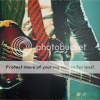 Mine.
Mine.
 MissAravis'.
Not perfect, but close enough. 
A few tips for using this coloring -
-You will most likely need to leave off a lot of the Hue-Saturation steps (or modify them to fit the image you're working with). Also, I've found that if you raise the Overlap setting in the Hue-Sat window, it helps reduce grainy-ness caused by raising only one color. (I hope that made sense)
-If you're working with an image that doesn't have a lot of contrast in it to begin with, then you should probably leave out the Levels, Curves, and Brightness-Contrast steps (or maybe just leave out the Value channel parts). If you don't, your image will be rather washed out.
Here's a few icons that I made using variations of this tutorial...
![]()
![]()
![]()
(on all of these icons, I left out several Hue-Saturation steps, or modified them, and possibly added some Channel Mixer.)
Enjoy! 
--- flambeau
President of the Manalive Conspiracy
Founder of Team Hoodie
Icon by me

