lon: Such lovely colorings on those avies! My favorites are #1, 4, and 8.
campgirl: Love the coloring on #4!
Here are a bunch from me.


Comments are love. Credit is nice but not necessary. Please don't claim as your own.
~Wunder

"The task of the modern educator is not to cut down jungles but to irrigate deserts." ~ C. S. Lewis, The Abolition of Man
Forum 1.0: 1303 posts
WC: 60
Once again, I am behind in comments.  I'll do brief comments, but I don't have time to catch up on everything.
I like the black and white on 6, the textures are wonderful too. Would you mind posting the texture you used on it? ... And 8 has me captivated too! May I use it sometime?
I'll PM them to you in a little bit.  (Sorry I didn't get back to you about this sooner.)
You most certainly may!  Thank you!
Becca, your coloring and just overall graphic style is so lovely right now! You are doing wonderful! Keep up the excellent work!
WunderLu, I'm loving #17 of this post! Great stuff!
Maddy, as always, your icons are brilliant! I love them all, and your 20in20 Edmund set it awesome!!
Quinlin, so wonderful to see you in here again! Your icons are excellent! Great coloring and textures!
Here's a few from me. I've been playing the graphics game in the chatroom, and that has helped to get me back in the Narnia mood. 
![]()
![]()
![]()
![]()
![]()
![]()
![]()
![]()
![]()
![]()
Anyone can use with credit. C&CC welcome.
--- flambeau
President of the Manalive Conspiracy
Founder of Team Hoodie
Icon by me
Oh, wow!! Beautiful avvies, everyone!!!
Comments for this page...
Dot, ooh, those are very pretty! I especially like the text on the second one! 
Emmie, nice job! A little constructive criticism is that you might want to make it brighter, since it's a little dark right now. 
WunderLu, first post: Ooh, those are so gorgeous!! The designs of both of them are fabulous! Second post: Were these for an Edmund and Lucy 20 in 20? *looks* Ah, I see they were.  Wonderful work! My favorites are 1, 3, 8 (!) and 20!
Lon, I LOVE #'s 1, 5 and 8!! 
Tarkheena, neat design on the first one! I also like the blurred look on the second one!
NarnianCricket, welcome to NarniaWeb!  Great job on those avatars! Coloring on images from the Night Raid is hard to do. I think Susan's face might be a bit purple on the second and third ones, but it might be my computer screen.
campgirl, lovely work! My favorites are 2 and 6! 
Damsel, two and three are great!
flam, whoa! Okay, those first five are sheer awesomeness!! Faves are 2, 3, 4, 8 and 9!
I haven't posted in here in...forever, so I'm a little rusty, but here are some from me.. 
![]()
![]()
![]()
![]()
![]()
![]()
![]()
![]()
![]()
![]()
![]()
![]()
![]()
![]()
![]()
![]()
Kind of an odd assortment there, but I hope y'all like them.  I went a little crazy with light textures on some of them.
Anyone can use. Credit is nice, but not required. 
~Djaq
When things fall apart, be glue.
Team Hoodie!!
I tried this one again... I have to say it is probably the worst one I've done... But


Co-founder - NW for HP & The Missing Club
Djaq, I love the colors!!! And the light dots are great!
![]()
Thanks to Shastafan for the Signature and thanks to lizzyhenley009 for the avatar.
Nice Job everyone! 
I'm really sorry, but no time for comments, i have schoolwork to do. Just came by to drop some more Prince Caspian/Ben Barnes avies:
Comments and critique is nice and greatly appreciated. 
If you use please credit,  Thank you!
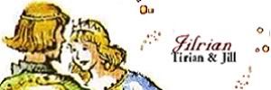
Long Live King Caspian & Queen Liliandil Forever!
Jill+Tirian! Let there be Jilrian!
daughter of the King, I like #4 & #5 a lot!
americangirlemmie, I like your text choice of "The True King".
Wunder, (first post), it's Eustace! I like the cropping on both of those.
lover of narnia, great work!! I like the last three best.
Tarkheena, I like the texture on the last one. 
Narnian Cricket, I like the overall feel and...blueness of the night raid ones, if that makes sense. 
campgirl, #4 & #5 are so pretty!
DamselJillPole, awesome Ben Barnes avis! They look great.
Wunder, (second post), those are really pretty. I like the ones of Edmund & Lucy.
flambeau, I love the cropping, especially the ones of Lucy.
Djaq, those are so beautiful, all of them. I can't pick a favorite. 
Here's a batch from me.  Comments are loved. Anyone may use with credit.
(credit to Spareoom.net & the wonderful people who have shared textures right here on NarniaWeb.)


av by dot
MountainFireflower, Great job!  I especially like the seventh one
![]()
Thanks to Shastafan for the Signature and thanks to lizzyhenley009 for the avatar.
I know I won't be able to catch up on comments (I last posted on page 50, I believe), so I'm just going to comment on the last page.
MountainFireflower: I really like 6 and 9; unusual but great effects
on those two. 
 And your cropping on all is good. #3 seems a little bit fuzzy, though?
DamselJillPole: 1st Post: Good job on the cropping and coloring. Especially #1. 2nd Post: Love the cropping on #1! (again!  ) I like 4 also; good coloring.
americangirlemmie: The text on the Aslan avi in your first post was extremely difficult to read. But your second "True King" avi definitely came out better. The text is a good choice for the image, and the overall feeling is very soft and calm.
Djaq: *gasp* #5 is so beautiful! 7 is awesome too, especially texture-wise, and 16 is a sweety. 


flambeau: I hope you don't mind me saying that I find #1 a little unsettling, image positioning wise?  Your whole batch has gorgeous coloring, but especially 8 and 9.
 I like the cropping on 9 + 10, as well.
Wunderkind_Lucy: 1st Post: On #1 the way you integrated the frame into the overall feeling and coloring is really something. I like the textures and coloring on #2 as well. 2nd Post: You did a great job with the background replacements!  And #2 is very nicely done.

campgirl: Nice to see the image you used for #6; don't see that one in graphics at all, really!  I really like your coloring on 4, 5, and 6.
NarnianCricket:  I like your font choice for #1, but the overall coloring for that one seems a little on the bland side. Good texture work on the two "Night Raid" avis. I like the text color, and I think that the text placement on #3 works best.
Tarkheena: Wow! I love your concept for #1! 
 And your coloring on #2 is great as well. That's a tough image to color.
lover of narnia: 7 is so beautiful!  The lighting, coloring, cropping, text placement, everything!
 The other ones that really stand out to me are 2 and 3 (what is the difference between these, if you don't mind me asking?
  ), which have exceptional coloring, and 8, which came together in a very pretty way.
daughter of the King: You've got some neat work here!  #s 3, 4, and 5 are very good. Your use of textures on those three avis is just right. The cropping and lighting in 3, and the coloring of 4 and 5 are beautiful. The blending on 5 is great.
Credit to the following for my very mixed batch: Hyaline12, Wunderkind_Lucy and also sanami276 on DA, for textures. Spareoom.net for some screencaps.

Comments, criticism, and credit are ever welcomed!
"In the end, there is something to which we say: 'This I must do.'"
- Gordon T. Smith
avi by Flambeau
Lovely work, everyone! 
Just four from me today:
![]()
![]()
![]()
![]()
I made the first three and then I felt I should make a quick one of Ed so I'd have all the Pevensies... but I think it ended up being the best one. 
Anyone may use with credit!
Hyaline: So beauteous!  I love the warm coloring in your first two, and the text placement in the last two is very cool.
  The only thing I'd change is the font in #1. I can't read it all.
Here's a few from me, taken from shots of the VDT cardboard thingy in theaters. Susan looks awesome, but I don't think she shows up with that cool hair and make-up in the movie -- at least, not from anything we've seen yet. 
![]()
![]()
![]()
![]()
![]()

avvie & sig by me
Team Hoodie!!!
Hoot Owl Of NarniaWeb
Beautiful work, everyone!  Since I haven't been here in a bit and time is limited, I'll have to just comment on the last two pages. But it all looks lovely!
Page 52:
Quinlin, lovely batch! Your use of textures is beautiful! Favorites are #1, #4, #6, and #10.
Becca, first post- Pretty bright coloring and a very unique design on that icon! Second post- Wonderful colors and cropping on #6!
DamselJillPole, first post- I really like the grungy greyness of the last two! Second post- The whole second row (#6-#10) have really neat coloring and textures! Third post- I love seeing the pics of Laura.  Fantastic textures on those!
Awel Prince, great job with those! They all look lovely!
Wunder, first post- I like the bright softness of #2! Second post-Beautiful work! The first three in particular are just stunning!
Vi, I love the cool tones contrasting with the warm in #2!
pg. 53:
Dot, great job on those! I especially like the black-and-white on #3 and the soft blurriness of #5 and #9!
americangirlemmie, really nice cropping on that icon!
Wunder, first post- I love the coloring and paper texture on #2! Second post- Hurrah for lovely Ed-Lu icons!  My favorites are #2, #5, #6, #8, and #12!
Becca, beautiful batch! I love the last four!
Tarkheena, really pretty, soft coloring on #2!
NarnianCricket, nice job with the textures on #2 and #3!
campgirl, excellent work! The coloring on #1, #2, #3, and #5 is just lovely!
Damsel, first post- I love the pink textures on those! My favorites are #1 and #2! Second post- Great cropping! Favorites are #2, #5, and #6.
flambeau, gorgeous work! The coloring and cropping on #6-#10 are truly lovely!
Djaq, stunning icons--I love the textures! My favorites are #1, #5, #9, #11, and #12.
MountainFireflower, wonderful cropping and textures! I especially like the creative design of #6, #7, and #9!
And this page!
Adeona, great work! I love the scratched-out texture in #4 and #5, and it's fun to see a BBC Narnia icon!
hyaline, wow! Such a lovely batch! I can't choose a favorite!  What does the small text in #4 say?
Tarkheena, awesome coloring and cropping! My favorites are #1, #2, #4, and #5!
And a batch from me (lots of variations!  ):
):


I'm not thrilled with some of these, but oh well. Comments and CC are wonderful!  Credit appreciated but not required.
Textures by: Daylight, hyaline12, and blue-emotion @deviantart.
the light after the storm
shows that hope was never gone
Snow After Fire graphics
Thanks for all the compliments, I wish mine were as good as your guys'.
ALL of the looks stupendous. I love ALL of them!
Funny you should bring in some LWW avi's. I just made a big batch of them:


Okay, I must give credit for textures, brushes and bases. It all goes to Flambaeu, Djaq, Spareoom.net and MANY others  Thank you all so much. I never could have made them without you.
Credit is nice, not necessary, comments are love and I would love to know if you use them, so please ask ^_^
~VFK~
page 53--
DamselJillPole: (1st post) I like the colors and textures on 1 and 2. Cool cropping on 1!
Wunder: Wow, great colors!! 1, 3, 5, 7, and 8 are adorable! Great job! 
flambeau: Neat blending on 1 and 2. And I love 8!! 
Djaq: I like the cropping and colorings, and the layouts on 7 and 8. I like 13, 14, and 15 best (I think)! 
americangirlemmie: That looks better than the other!!
MountainfireFlower: 1 and 2 are cute! I really like 8 and 9, too! really cool look on 9. 
page 54--
Adeona: I like 2, and the scratchy texture on 4 and 5!
hyaline: Those look great!! My favorite is 2 
Tarkheena: 5 is pretty good!  Nice job!
malkah: I love your use of textures! I like 1, 8, and 9. 
VFK: Oh, wow. I love all of them!! 2 and 22 are my favorites!! 
So.... I dropped my laptop the other day... and the hard-drive is busted  And I've been borrowing my mom's computer (which doesn't have gimp) until I get my replaced. So, none from me.
Thanks for all the comments on my last batch! Y'all are so sweet! 
--cg
Team Hoodie! | Keeper of the Secret Magic | ♥
Thank you all so much for the comments!! 
Page #53...
Emmie, I think that avy turned out really well! Good work! 
Damsel, great cropping on those! Really nice job!
MountainFireflower, (I love your user name! It makes me happy!  ) lovely job on those avatars! I love the designs of 4 and 6! #8 is my favorite!
Adeona, ooh! The second one is beautiful! 
hyaline, it's always fabulous to see work from you! I love all four avvies! Hmm, my favorite is probably 2 or 4!
Tarkheena, LOVE the cropping on those! My favorites are 1 and 2!
malkah, loveliness!! Beautiful textures! Let's see, my favorites are 1, 5, 6 and 8!
Vi, great batch! My favorites are 4, 8 and 10 (this one is just beautiful!)!
Aww, I'm sorry to hear about your hard-drive, campgirl! 
 I hope you're able to make graphics again soon!
Here are some more from moi...
![]()
![]()
![]()
![]()
![]()
![]()
![]()
![]()
![]()
*cough* Sorry for all of the variations. 

Anyone can use.
~Djaq
When things fall apart, be glue.
Team Hoodie!!

