
Page 1 / 4
Next

I thought these deserved their own topic. I don't love the AI-esque style for these but once I got over my initial disappointment, I quickly started to warm up to them. Well, some of them.
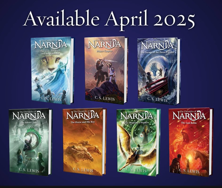
The Lion, the Witch and the Wardrobe
This one bugs me. The character design for the White Witch is pretty nice but there's no scene in the book where all four Pevensies fight her. The closest we get is Peter (and possibly Edmund) doing that in the climactic battle and that's after Maugrim, whom you can see by the Witch's side on the cover, dies. Even if they're trying to appeal to fans of the movies, which focused more on action, there's no such scene in the cinematic LWW. So it even fails at that!  And how come Lucy is using a sword instead of a dagger? In a behind-the-scenes Facebook video Harpercollins released, we do see the Stone Table on the back cover, which elevates this cover a bit but it's definitely one of the most misleading and irritating.
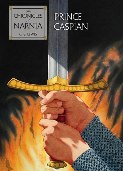
Prince Caspian
I really like this one, which may surprise some of you who are on the Narniaweb Discord since I wrote there that I disliked emphasizing action on the covers of Narnia books that aren't driven by it. But even though more of the book is spent wandering in the woods than literally fighting bad guys, I feel like, metaphorically speaking, it's about a conflict between Peter's Narnia and Miraz's Narnia. The only thing that really bugs me about this cover is the dramatic-looking rock at the bottom. Pretty sure Peter and Miraz were on even ground in the book. (Maybe this isn't Peter and Miraz? Maybe it's a different battle.) I actually do like the flowers though. The contrast between their beauty and the violence of the rest of the scene makes me think of Old Narnia sneaking up on them.
The Voyage of the Dawn Treader
This one is weird. While the sea serpent does wrap its coils around the ship in the book, it tightens them. There's way too much room between the coils and the ship in this picture. And what's with Reepicheep's pose. I guess he's shouting, "Don't fight! Push!" But it'd make more sense for him to be pushing himself in that situation. It honestly looks like he's dancing in this image.  I don't hate the idea of showcasing the sea serpent scene on a cover of The Voyage of the Dawn Treader, but I wish more cover artists would try to showcase the dreamy, poetic aspects of the book. Chris Van Allsburg is the only who has ever tried.
The Horse and his Boy
That's more like it! Despite all the sand, I assume this is the characters racing across the river, given the armor Aravis wears. I love the contrast between her clothes and Shasta's and the sense of desperation you get from them and the horses. I don't have a problem with putting an action scene on the cover of a Narnia book if that particular Narnia book is driven by action and that's true of The Horse and his Boy. I also like how Aslan looks scarier on this cover than on the others. That's in keeping with the plot. On the back of the cover, you can see the Ancient Tombs. Wish they were on the front.
The Silver Chair
This one is OK. The Silver Chair is another Narnia book where I feel that showcasing an action scene is appropriate. The story may not be wall-to-wall action, but it's got more suspense and adventure than some others. Like some of the other new covers, it more of a metaphorical image than a literal one. It portrays the silver chair as being behind Rilian when he's fighting the serpent even though it should be destroyed, and it makes it much bigger than the book describes. But I don't find the non-literalness distracting. That's because the symbolism is easy to grasp. The chair looms large over the characters. I'm a bit cynical about how they show Jill trying to help fight the serpent when she doesn't in the book. Strikes me as false advertising. But, hey, it fits with her generally pugnacious character. (Susan firing an arrow at the White Witch, on the other hand, just feels wrong.) My biggest problem with this cover is that Puddleglum isn't on it. He is going to be on the back cover but he's such an important character and he does try to help Rilian fight the serpent in the book...why shouldn't he be on the front?!
The Magician's Nephew
OK, this cover is just silly. They're trying to convey too many things at once. I understand the impulse since there are so many cool scenes in the story but the effect looks goofy IMO. I guess it's nice that they're trying to symbolize fleeing from temptation but when the heroes fly away from Jadis in the book, they fly up, not down. The only reason for the angle seems to be that the artist wanted to include the rings in the picture. And they just look silly. And what is up with Jadis's coloring? Green circles around her eyes and blue hair? What?!
The Last Battle
The falling stars at the top are cool. I like the feeling of intensity you get with all the flames and stuff. The only thing that really bugs me is the image of someone (Lucy? Peter? It can't be Tirian because he's elsewhere on the cover) looking through (I think) the doorway of the stable. It's cool that they wanted to represent both the dark part of The Last Battle and the bright part on this cover, but I feel like the bright part of the image is so vague that it's just confusing. Tash will be visible on the back of the book. Again, with not putting the cool stuff upfront.
This topic was modified 1 year ago 3 times by Col Klink
For better or worse-for who knows what may unfold from a chrysalis?-hope was left behind.
-The God Beneath the Sea by Leon Garfield & Edward Blishen check out my blog!

@col-klink Out of interest, where did you get that image? It's showing the seven books in original publication order, not in chronological order, and the latter is still the official "reading order" as promoted by HarperCollins themselves as far as I know.
My thought on the covers themselves is that they're really not to my taste — and they do indeed look suspiciously like AI art — but they have some good points. I largely agree with your assessments of them.
"Now you are a lioness," said Aslan. "And now all Narnia will be renewed."
(Prince Caspian)
Posted : February 13, 2025 4:52 pm

Personally, I am not a huge fan of spoiling parts of the book on the front cover, but since not all of these scenes on the cover are even accurate, I guess it's not really spoiling scenes.
But, that is not necessarily a good thing. I think they just tried to shove a lot of characters on the front covers. But, if I chose the two best ones they would be HHB and the Silver Chair, although Puddleglum should be on the front cover if everyone else is going to be.
Homeschoolers taking over the World!
Member of RD's club.
VP of the CWM club
Dragon fan club
I Support Scrubb!
Posted : February 13, 2025 5:00 pm
I got the image from googling "harpercollins narnia" and then narrowing the results down to the most recent. FWIW, Harpercollins's Facebook actually released a video that featured the artist of the covers, so they're definitely not AI. The artist just wanted it to look like his work was made by AI for some reason. 
This post was modified 1 year ago by Col Klink
For better or worse-for who knows what may unfold from a chrysalis?-hope was left behind.
-The God Beneath the Sea by Leon Garfield & Edward Blishen check out my blog!
Topic starter
Posted : February 13, 2025 5:06 pm
Courtenay liked

I actually really like the cover for HHB. After that, they range from "it's okay" to "I really don't care for it." And I'm in agreement with everyone about the cover for LWW. It's just flat out inaccurate and that's really too bad.
Based on the order of the books in the picture, it would be so interesting if they went back to publishing this series in the original publication order, ESPECIALLY since it looks like they're making the Magician's Nephew movie first. Irony much?
ETA: I had another thought, it's POSSIBLE that Owen Richardson has some inside knowledge to the general story that's being produced by Gerwig and Netflix and created the artwork based on that.
Posted : February 13, 2025 7:15 pm
I actually really like the cover for HHB.
I'd say HHB is the best of the lot in my estimation too. My one gripe is that it's not exactly a scene from the book. It seems to be portraying the episode where Shasta and Aravis (and Bree and Hwin) first meet, when they find themselves riding neck-and-neck as they're pursued by what seems to be at least two lions, one on either side — except, of course, as we find out later, "There was only one lion..." That's accurate enough, including the only one lion! But that scene happens in near-total darkness, whereas this artwork is apparently the scene where they're riding through the desert, and they don't have Aslan with them then. Well, at least, not visibly...  (He does of course reappear and chase them when they get to Archenland and need to be spurred with "the new strength of fear" so that Shasta is in time to warn King Lune of the approaching Calormene army — that's the part where Aslan wounds Aravis — but they're a long way out of the desert and into fresh green country by the time that happens.)
After that, they range from "it's okay" to "I really don't care for it."
Me too. I don't really like the style overall, but then I haven't been a huge fan of the covers of many of the recent editions either. They're OK at best. But as long as the books are still in print, and with the original text as C.S. Lewis wrote it — not "updated" or outright censored for modern tastes (as has happened with a number of classic children's books) — I'm not majorly upset.
Based on the order of the books in the picture, it would be so interesting if they went back to publishing this series in the original publication order, ESPECIALLY since it looks like they're making the Magician's Nephew movie first. Irony much?
I was just thinking the same thing myself!
ETA: I had another thought, it's POSSIBLE that Owen Richardson has some inside knowledge to the general story that's being produced by Gerwig and Netflix and created the artwork based on that.
Oh no... so when Netflix gets to LWW (which may be Gerwig's second film), we can expect a showdown at the end where all four Pevensies directly battle the White Witch, including sword-wielding Lucy the Warrior Woman? And does this also mean in MN (which we're expecting first), Jadis is going to be rocking the blue hair and green eyeshadow look?? Oh well, that'll certainly make clear this is a totally new take on Narnia... 
Edited to add: I've just been looking at the short video with the artist Owen Richardson, featured on the NarniaWeb news page about the new covers. I will say he's spot-on right about each book having its own individual flavour and atmosphere (that's one of the things that's so interesting and endearing about the series as a whole, that each of the seven books is so individual and there's no way you can get mixed up as to what happens in which one!), but I cringed at his statement: "It's almost like C.S. Lewis was telling me what he wanted done." Hmmm... bit of ego there??? 
(I'm guessing he was intending that to mean that every book is so distinct that he, as the artist, had a clear vision of what each one is mainly "about" and how that could be reflected in the artwork for each cover, which is fair enough. But the way he words it there, it sounds like he's implying that he was somehow personally able to "channel" Lewis's spirit and to receive Lewis's own instructions for what he wanted on each cover. Which is... an audacious statement to make at the very least, and one that I would guess Lewis himself would most likely not be happy to hear at all.)
However, at least Richardson lets on that he has definitely read all the books. Which makes it all the more baffling that he made such a mistake on the cover of LWW.
"Now you are a lioness," said Aslan. "And now all Narnia will be renewed."
(Prince Caspian)
Posted : February 13, 2025 9:04 pm
I really dig these covers.
They are bright, colourful, and brimming with dynamic energy. If I were a child right now they would make me dying to read them.
There is so much detail and movement within the image it just makes them so captivating.
Especially when you then compare the designs to the last set of official covers by David Wisener which had flat boring images such as this:
In many ways, the new designs remind me of the Roger Hane covers from the 1970s - just with slightly better art style .
p.s. I wouldn't necessarily worry about any of the smaller little details on the covers myself. These sorts of things are more about the vibes and the energy, rather than necessarily verbatim reflections of the story content.
The poster for Walden LWW for example features an image of the three children climbing up a cliff in the dark, which isn't in any version of the film or draft scripts as far as I'm aware.... They likely just put it on the poster however because it fills out a bit of vertical space in the top right corner and evokes enough of the same sentiment that the movie was going for to give audiences the right idea of what to expect.
Posted : February 14, 2025 1:25 am
@icarus I actually really enjoy David Wiesner's picture books, but I didn't like the covers he did for Narnia, largely for the reasons you mention. (Man, I'm so bad at staying on topic, I'm even going off topic in the thread I started! )
For better or worse-for who knows what may unfold from a chrysalis?-hope was left behind.
-The God Beneath the Sea by Leon Garfield & Edward Blishen check out my blog!
Topic starter
Posted : February 14, 2025 8:11 am

I really love the HHB illustration. While it doesn’t depict a specific scene from the book, it fits thematically, with Aslan actively present in the background—even if Shasta isn’t aware of him.
Overall, I much prefer the full illustrations featured on the homepage, as they better evoke a sense of atmosphere. Many of the covers (especially LB and MN) feel too busy yet lack a strong atmospheric presence as the actual books.
"Tollers, there is too little of what we really like in stories. I am afraid we shall have to try and write some ourselves." - C.S. Lewis
Posted : February 14, 2025 3:13 pm
If I were a child right now they would make me dying to read them.
For what it's worth, my son walked by, looked at the books over my shoulder, and was like "Wow, those are really cool. But I like the ones we have a little better." (I have the 1994 editions with cover art by Cliff Nielsen. I bought them BECAUSE I loved the art on those. Somewhere I also own the 1986 set with art by Daniel San Souci.)
I realize that these Narnia films and merchandise are likely going to be made to appeal to the next generation, which is fine. I have my sets that I'm perfectly happy with.
I really love the HHB illustration. While it doesn’t depict a specific scene from the book, it fits thematically, with Aslan actively present in the background—even if Shasta isn’t aware of him.
100% this.
The HHB is my favorite of all the covers by a long shot. I know the Baynes illustrations had some of this feel, but this takes the culture of the story to the next level. It feels more tangible.
LWW - reminds me too much of the Walden movie poster.
MN - too green. I understand the theme of new life, new start, but let's just say moderator flashbacks.
VDT - I like the coils. Not as crazy about it , but it's not bad.
SC - need a touch more green, but I get the silver tones.
PC - the trees are the best part
LB - they need to remove the three falling stars that look like they are punching Aslan in the face, but other than that, I like it doesn't soften how dark the story gets at times.
I don't dislike the book covers as a whole. I like bits of all of them. I'll probably buy a set so I can have a hard back copy if I can get past the planetary symbols incorporated.
Posted : February 14, 2025 3:48 pm
Courtenay liked
I'll probably buy a set so I can have a hard back copy if I can get past the planetary symbols incorporated.
I was just wondering "What planetary symbols??", until I saw the latest news here on NarniaWeb: High Resolution New Narnia Cover Art Reveals Hidden Easter Eggs
That does it for me. Owen Richardson, regardless of the merits or demerits of his art, is obviously a proponent of Michael Ward's Planet Narnia theory. Which is just so blatantly, completely, ridiculously bogus that it staggers me that anyone who's truly familiar with C.S. Lewis — with his works as a whole and how he thought and wrote — can take it as gospel.
That, on top of Richardson self-satisfiedly declaring that he felt "almost like C.S. Lewis was telling me what he wanted done"... I'm sorry — I've no doubt he means well, but — I really don't think this guy genuinely understands Lewis, or Narnia, or Aslan, at all.
I'll stick to my vintage 1960s Pauline Baynes covers, thanks very much!!!
"Now you are a lioness," said Aslan. "And now all Narnia will be renewed."
(Prince Caspian)
Posted : February 15, 2025 6:16 am
NotSwanwhite and coracle liked

They certainly look modernised... like a lot of children's/YA fantasy books selling in book shops right now. In that, I can't deny they could be very appealing to those coming to the series for the first time, (and I hope they help bring more fans to Narnia). Yet at the same time, because of this, do they stand out enough against other books?
Personally I'm not for making these novels look too much like other action-packed fantasy series because they feel more their own thing, more special and charming than other series. The traditional, quieter look of the Baynes covers just fits the best for me. 🙂
Posted : February 15, 2025 8:33 am

I don't like these enough to buy them as a set and I'm perfectly happy with my current hardbacks, however I do like HHB and would consider buying that one individually.
Although AI-esqueness and planetary images aside if these are numbered in publication order then I'd definitely buy due to my pure stubbornness and need to be right. I'll finally have proof for my (to a non Narnian) seemingly obscure numbering system and evidence that this is the correct order (because even the publishers agree ... ) And if I happen to gift a boxset to someone unfamiliar with the series I'll no longer have to explain why I've rearranged the books and am telling them to ignore the spinal numbers.
'It is not easy to throw off in half an hour an enchantment which has made one a slave for ten years' - The Silver Chair
Posted : February 15, 2025 5:24 pm
Courtenay liked
I've seen so many Narnia fans online, even ones who aren't crazy about the artwork, expressing approval at the books being in publication order that I feel like someone should show all the comments to Harpercollins. Maybe then they actually would use that numbering. (I'm guessing they're just shown in publication order in the advertisement for some reason.)
For better or worse-for who knows what may unfold from a chrysalis?-hope was left behind.
-The God Beneath the Sea by Leon Garfield & Edward Blishen check out my blog!
Topic starter
Posted : February 15, 2025 6:12 pm
Moonlit_Centaur and Courtenay liked
Page 1 / 4
Next
Forum Statistics
31
Forums
5,139
Topics
365.4 K
Posts
1,721
Online
2,393
Members
Latest Post: First-Shall-Be-Last Geography Our newest member: Falaskan1 Recent Posts Unread Posts
