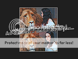
I had an idea for a wallpaper last night, so I fiddled around on Gimp for a bit and came up with these! The design is very simple, but that was the look I was going for. I couldn't decide which layout I liked best, so I did it both ways.
The idea behind them is that even though Lewis says that Susan tried to forget about Narnia and pretend like it never happened, I personally believe that she could never truly forget about Aslan. I believe that, in the end, she did acknowledge that she was wrong to try and forget it, and she did go to Aslan's country when she died.
The text is not referencing the Susan/Caspian abomination in any way, shape, or form!
The text is from the song Vanilla Twilight by Owl City (Adam Young). The first time I heard that part of the song, I thought of Susan.
Edit: Two more versions! 
^Click to enlarge^
Comments and constructive criticisms are appreciated!
--- flambeau
President of the Manalive Conspiracy
Founder of Team Hoodie
Icon by me
Those are gorgeous, flambeau! 
The design is very good and the coloring is stunning! I love how the background isn't exactly black, and it's kind of gray. I think that I like the first version best! The way the images are placed is really lovely! The text fits it REALLY well (it's a beautiful song), and you have done a wonderful job putting everything together (combining all of the elements  )!
)!
You should be very proud of this wallpaper and I look forward to seeing more from you! 
~Djaq
When things fall apart, be glue.
Team Hoodie!!
Caspian and Susan ABOMINATION!??????? (Sighs) I'll try to ignore it....but....did you have include that word??? That STRONG of a word? some of us like their pairing flambeau,. I'm really not trying to be rude... 
(I have nothing against you and your dislike of them....believe me. I wasn't trying to be rude at all  )
)
Very nice wallpapers!!!! 
 I think I like the first lay out best with the pictures side by side. I think it has a stronger connection that way. Wonderful coloring and choice of pics to fit the text!!! Nice lyrics!!! Love it!! If you don't mind a may use it on my desktop?? It's very very nice!!!


Loyal supporter of Caspian/Susan.
NW Family: Aunty Vi, LadyC, Rose, Chloe
Secret Order of the Swoosh.
Keeper of the Secret Magic
L6
I really like the concept used in these wps flambeau  . Layout looks good on both. Originally, I thiught that I much preferred the "widescreen" look, but now I'm really bouncing back and forth between the two. The two images side by side work well in the fact that there's match up in reading the text, left to right, so the eye automatically makes that connection (I'm not sure how I feel on the two images touching the frame of reference on the entire piece, but that's just me). I think that the images placed on top each other also works well. To me it's like a strip of film, which could symbolically represent a passage of time, and connect even further how time will heal Susan and change her. For some reason, on this version, I really like how much the text overlaps the imagery (I couldn't tell you why though). Text works really well with your choices of imagery, in context, design, coloration, and font. To avoid the Caspian reference, I feel that the piece would read more effectively if the two images swapped places. When I read the text, I connect the first line with the first image and the second line with the second image. To me, I see it as the image of Susan looking off into the distance should connect with "the world that I knew" and Susan looking at Aslan would match up with "I won't forget you" (I think just swapping the placement of the two images would really strengthen the connection between text and imagery and would further push the concept idea you were looking for). The coloration on the imagery is superb as well, I really like how all the colors on Aslan are heightened (looks really good). Both are indeed simple wps, but I think that they are both fantastic in pushing your concept and are really strong on the visual level. Nice work
  .
.

Sig by Dernhelm_of_Rohan
NWsis to eves_daughter & ForeverFan
The layout is beautiful and the words fit perfectly with the picture! I love it, very nice work! 
"We have nothing if not belief"
That's gorgeous! I love it!  The coloring is beautiful and I love the layout and the text! The pictures you chose are really cool! Fantastic job! I think I like the first one best.

Founder of the Dragon Fan Club - PM me to join!
Team Hoodie!
I've met Michael English!
Avie and sig by theprincessspy.
Gorgeous work, flambeau!!  I love that song (Owl City/Adam Young is awesome)! I also love the coloring; it's beautiful!! I'm not sure which version I like better... but since I read Lion's Emblem's comment I think that the images switched might look really cool! All in all, absolutely lovely job and I can't wait to see what else you make!!

She hoped to be wise and reasonable in time; but alas!
She must confess to herself that she was not wise yet.
Call me Maddy! | my livejournal
Proud Attolian Recruiter
My, I really, really like those.  I think I'm going to have to listen to that song now-the words combined with the pictures just made me stop and sit completely still for a moment.
I like your thoughts behind the wallpaper. It makes a lot of sense. 
Oh, and while I can understand how the images would work flipped, I also see the reasoning behind why you positioned them how you did. (at least partly) So that Susan would be looking in. I also think it "flows" a little better like that.
Wonderful job, flambeau!

Flambeau I'm really sorry for what I said. I understand your opinion. I'm sorry for what I said. I was just standing up for what I like..I'm sorry if I made you feel bad or anything.
Your wallpapers are ABSOLUTLY LOVELY!!! I really like the concept and idea....I really like color. The layout is perfect to me!!!! (I just wanted to comment again) I think you have a lovely piece here and should be VERY proud of yourself. Wonderful and great job!!!! I really like your idea!!! Y GOOD!!! 


Loyal supporter of Caspian/Susan.
NW Family: Aunty Vi, LadyC, Rose, Chloe
Secret Order of the Swoosh.
Keeper of the Secret Magic
L6
Wow! I really like these!! I think I like the wide screen best, but like you, I find it hard to choose.  The coloring is lovely, and the text is astonishingly fitting! I agree with your belief on what happened to Susan exactly, just my thoughts! lol Great job!
![]()
Sig by me | Av by Ithilwen
There is no such thing as a Painless Lesson
Simply Beautiful!!  and the text from owl city really fits it
Well, it's taken me over three weeks to finally post in here again!!  Sorry, life has been crazy busy!
Thank you all for the comments!!  I really appreciate them!
The text fits it REALLY well (it's a beautiful song), and you have done a wonderful job putting everything together (combining all of the elements
)!
Why, thank you, Djaq (I seem to work better when you're/she's near  )!!
)!!  I love the song, and the text fit it so well!
Caspian and Susan ABOMINATION!??????? (Sighs) I'll try to ignore it....but....did you have include that word??? That STRONG of a word? some of us like their pairing flambeau,. I'm really not trying to be rude...

(I have nothing against you and your dislike of them....believe me. I wasn't trying to be rude at all
)
No worries, I'm not offended!  And I apologize if that word annoyed you. I used it as a joke, and was referencing a quote by... glumPuddle, maybe? (I can't remember who said it, actually.
  ) I found it amusing that he/someone took it that far.
If you don't mind a may use it on my desktop?? It's very very nice!!!


Not at all! 
To avoid the Caspian reference, I feel that the piece would read more effectively if the two images swapped places. When I read the text, I connect the first line with the first image and the second line with the second image. To me, I see it as the image of Susan looking off into the distance should connect with "the world that I knew" and Susan looking at Aslan would match up with "I won't forget you" (I think just swapping the placement of the two images would really strengthen the connection between text and imagery and would further push the concept idea you were looking for).
Thank you for the comments! I actually realized that I needed to switch the images right after I made it, but it was late and I didn't have time to fix it right then. I've fixed it now, and I've edited them into the first post of this thread. 
Thank you greenbird and Narnia Girl!! 
I love that song (Owl City/Adam Young is awesome)!
Isn't he, though?! That song is awesome! 
...since I read Lion's Emblem's comment I think that the images switched might look really cool!
Please see my comment to Lion's Emblem. 
My, I really, really like those.
I think I'm going to have to listen to that song now-the words combined with the pictures just made me stop and sit completely still for a moment.
Do it! Do it!  It's really pretty!
Oh, and while I can understand how the images would work flipped, I also see the reasoning behind why you positioned them how you did. (at least partly) So that Susan would be looking in. I also think it "flows" a little better like that.
Oh, I actually hadn't thought about it like that.  I just positioned them in the order they were in my picture folder (turns out that they were in the wrong order though
  ), but that does make sense! Thank you!
@ Lover, thanks again! 
And thank you to Lady Courage and GuitArtist7 for the comments!!
I really appreciate all of the feedback from these wallpapers! Thank you all again! 

--- flambeau
President of the Manalive Conspiracy
Founder of Team Hoodie
Icon by me
I absolutely adore the colouring on the images and the beautiful use of the font. How did you manage to get it to glow? 

![]()
Avatar & Signature by Me
so lovely! I like the last two the best, am torn between them infact, flambeau's suggestion was a good 'un. 

Grief for the movies made me abandon narniaweb...but I'm so glad to be back!
Many thanks to the wonderful Lady Eowyn for making my sig/av.
Wonderful flambeau!  I love your contrast, coloring, shading, etc. Great text: good size, position, form. You should definetly play around more with wallpapers!
Amazing and yet simple! 


The *official First Follower of Aslan
Keeper of Susan's Grey Coat.
Avy:Badger
Sig:Beautiful_ltdwn


