I have time to make comments! Squeeeeeeee! 
narnia_lover127: 1st Post: I really like your concept for #3, and good blending. Good font choice for #7! 2nd Post: Concept and blending are great on #2, and I see a definite improvement overall in this batch (I hope you don't mind me mentioning that).
Pattertwigs Pal: Spot on with the LotR/Narnia sigs. #3 is my favorite. Don't worry about the text on #1, I think it's fine. Though maybe "Seeking [or "Seek"?] the East" would be better.
nz_narnia_nut: Wow! I really like this batch! Your coloring and text on "Merging of Worlds" are just gorgeous! I like the spot of color on "Just the beginning" #1 What font did you use for that one? "Magical" is beautiful!
lover of narnia: 1st Post: Of these I like the first best. Good job blending the DT image in with Ed. I like the bi-color background, it feels very "Oceany" 
2nd Post: Seamless blending on #1!  #3's text placement and color is great, but the text on #2 would perhaps be more Susan appropriate?
flambeau: The light effects on your island sig are really beautiful!  The overall coloring is great, also. Of the Lucy sigs I like the second better; I think because it's just simpler and the coloring is more to my taste.
LucyP0104: I really, really like your text placement and use of the bracket in "On the move"  "Dream of a Dream" is great text, too! Your Lucy sig is really good texture-wise.
I've gotten a little batch together, credit to - let's see - just Hyaline12 this time. Oh, and Spareoom.net for caps. 


Comments, Criticism, and Credit are ever welcome!
"In the end, there is something to which we say: 'This I must do.'"
- Gordon T. Smith
avi by Flambeau
(Everything here is posted and made by Dancingprincess Cari)
Hello, everyone! Looks great!
Lover of Narnia post 1: I love #3! the text color is just right! I also like the quote on #6.  Post 2: I like #3, even though its not super fancy, its very expressive.
Narnia_lover127:On #4 I love how the text goes from plain where it says prince, to a more elaborate font for king! 
Adeona : I love the texture on #1. You'll have to show it to me sometime. 
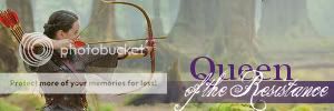
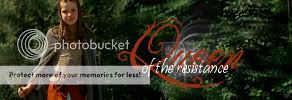
and I really love the purple colors on the Susan Queen of the Resistance sig. 
Here are a few sigs I made randomly:


 (this one is a little too small, sorry!)
Comments, criticism, and credit are all welcome!  Thanks, and great job, everyone! Keep up the good work!
9/5/10 *EDIT* If you use one of these (feel free to!  ) Please direct credit to NarnianCricket, Cari's new account. Thanks!
Here I am to drop off a random batch of Narnia Sigs! I did them in a game recently  Sorry for no comments. Maybe later...


C and CC is great. Credit is nice if you use
~Lover

Loyal supporter of Caspian/Susan.
NW Family: Aunty Vi, LadyC, Rose, Chloe
Secret Order of the Swoosh.
Keeper of the Secret Magic
L6
Everyones work on this page is simply fabulous! Keep up the great job everyone! 
Here's a few, matching avatars in the edition forum! 


Please Credit if you use,  Thank you!
Long Live King Caspian & Queen Liliandil Forever!
Jill+Tirian! Let there be Jilrian!
Here's a few of mine from Prince Caspian:


avvie & sig by me
Team Hoodie!!!
Hoot Owl Of NarniaWeb
Lover of Narnia, could you please post the heart texture you used on that sig?  I love it!
I hope to edit with comments shortly, but I don't have any of my own work to add at the moment, sorry! 
Edit:
Tarkheena: Yours are simple but good. Great text coloring and font choices! I especially like "Lonesome".
DamselJillPole: You've been doing some great work with the new group shot, but I think these sigs might have been a little rushed; they could use a little something in the way of texture or brushes.
lover of narnia: My fave of yours is "Journey's End", but they are all good! I really like the coloring and font choices on "Faun".
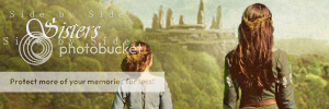
DancingPrincesses: My fave is definitely Aslan. Beautiful texture and coloring! I like the text font and coloring on Destrier, also. The sisters one seems a little bit stark, though; too strong contrast, I think. 


"In the end, there is something to which we say: 'This I must do.'"
- Gordon T. Smith
avi by Flambeau
Eustace Sigs!!!! 
I'm kind of new with the GIMP program, so don't be surprised if they're bad, haha.
I'm sorry the second one is so grainy. My Gimp Program was malfunctioning at the time, and some of the features weren't working right. Maybe when it's working again I can fix it somehow. 
Anyone can use with credit.
Note: I'm using the second-to-last one right now, but anyone can use it after I'm finished using it. 


~ Riella ![]()
Hey, you guys have done some pretty awesome work here!  Eustace+Jill, those are some great Eustace siggies. Bravo!

I've only done one siggie though, my very first... :
(lyrics are by Enya)

:music: risk it all cuz I'll catch you if you fall... if my heart was a house you'd be home :music:
Pepper Darcy, that's a really good one for your first!! I really like the font that you have on there. 

 <-made by nz_narnia_nut,avvie by Djeq
http://www.swagbucks.com/refer/narnianheart-You can get cool prizes when you sign up for Swagbucks (like Starbucks gift cards)!
Mod note time! *cues cheers and groans*
As the first page of this thread states...Please try to keep chat to a minimum; that's what the PM system is for. Comments on other people's artwork are appreciated and encouraged, but if your post does not contain either a thought-out comment or artwork, please think twice about sending it. Posts that simply say 'thank you' clutter up the thread.
Thanks, and happy substance-ful posting! 
~Djaq
When things fall apart, be glue.
Team Hoodie!!
Adeona: i really love how clea and bright your sigs are. The coloring on the first is sooo beautiful, that third one is so sweet, and love the fonts on the 'queen of the resistance' ones! Dancing Princess: the colors are really cool! i especially love the one of Destrier the pic just looks amazing and the one with the sisters is really sweet. lover of narnia: really amazing colors!! love the font on 'Faun', the heart on the one of Susan is sweet, and i really love the lighing on the one of the Dawn Treader DamselJillPole: those are really clear and look great! Tarkheena: those are sad but absolutely amazing!! the colors and fonts go soo well with the text and the pics you chose. really, they look fantastic!
Eustace+Jill: those look great! the coloring and lighting look fantasic! The texts are really cool and i especially love the 'look to the east' one. the colors are just beautiful!! Pepper Darcy: that is really beautiful! love the background color and the text is great!
or have you forgotten who really defeated the White Witch,Peter~Lucy

Avvie,sig:me!
Dancing Princess: that looks really cool, and without any textures?!! that is amazing
daughteroftheking: those are so beautiful. the first two are sad, but still look amazing. i love the coloring, and great job with getting a pic that really matches the text and coloring.
Here are a few from me. they aren't good, but i just got GIMP and wanted to try:


Comments and credit are loved
or have you forgotten who really defeated the White Witch,Peter~Lucy

Avvie,sig:me!
narnia_lover127, I really like the first one. I like the two pictures of Lucy. I might have moved the picture of the younger Lucy more to a side, but otherwise it looks great. They are very impressive for someone who is new to using GIMP.
NW sister to Movie Aristotle & daughter of the King


