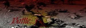
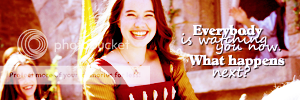
Ok. Yes, I am still on the Susan-not-believing-in-Narnia subject, but this time, its from Lucy's POV!  What I wanted to do here was convey Lucy's heartache for her older sister who was probably her role model and confident in the world (I think Lucy would have looked up to Susan very much).
Now, there are two pictures, but both are a part of the same "prayer". I couldn't really figure out how to fit them both together very well, so I just left them seperate. The second one is still Lucy's words though.
Lyrics are from "Prayer for a Friend" by Casting Crowns.
http://i1045.photobucket.com/albums/b45 ... Prayer.jpg
http://i1045.photobucket.com/albums/b45 ... Puppet.jpg

Oh my word!!! Those are amazing. Amazing. I think the first one is the best, I really love the words with the pictures, it's so sad and true - like I said, I'm loving your Susan phase right now, and that one was so amazing!! 

NW sisters Lyn, Lia, and Rose
RL sister Destined_to_Reign
Member of the Tenth Avenue North and Pixar Club
Dubbed The Ally Of Epic Awesomeness by Libby
Wow. A nice pair of graphics DaughterofEve1792.
Let me start with the first piece (well, because it's the first in your list and it caught most of my interest). Design and layout look good. Your choice of text works superbly with your choices of imagery, you've really captured the emotions (not only in the images, but through the concept of the piece). I especially like how Lucy and Aslan appear to look at one another while the flow of images of Lucy and Susan together is between them (as though Lucy and Aslan are reflecting on the same thing- if that makes sense). It's nice to see a variety of images for Lucy and Susan. One thing I would suggest here is cropping the top image slightly different. If you can help it, I would take a little more off the bottom rather than the top- notice how Lucy's and, in particular, the top of Susan's head gets cut off. For me, it becomes a visual distraction. The layout of the text is a little odd, but it still works, and more importantly, it's readable. The border motif that you have used in previous pieces also works really well here. Nice job on this one  . This is probably my favorite that I've seen from your work so far.
As for the second piece, design and layout look good. It's a bit odd to see a vertical piece, but, in an odd way, I think it works. When I see this format, I think about a strip of film and conceptually it fits with the piece. Maybe I'm making a stretch, but I can see it as film connecting with the middle image of the photographer and even further with the text- like a strip of film, Susan personality develops from one person into another. Again, maybe I'm just thinking too deep into it. Conceptually, text is a nice matchup with the layout of imagery. I especially like the matchups with the first and last panels. Nice work on this piece as well  .
.

Sig by Dernhelm_of_Rohan
NWsis to eves_daughter & ForeverFan
those are so amazing, brought tears to my eyes, I liked the first one best, in the second one the words seemed a little unclear, but they are both so wonderful, great job!
always be humble and kind
I love those! It's so beautiful and you matched the song lyrics so perfectly! I really like the second one with Lucy, it's just amazing! 

I've seen the movie...
LWW - 17+ (lost count)
PC - 7
VDT - 5
I loved them all!
Thanks Elanor, wild rose, and Narnian Wolf!!! 

Lion's Emblem: Thank you for your very constructive posts! I love reading them, and try to learn from them! Like catching whenever people's heads get cropped off at the top of pictures.  I see what you mean, and I watch out for that now!


