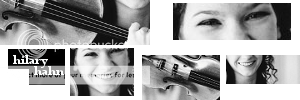
Hello...just playing around with textures and what have you.. thanks to Maddy for giving me the link to the textures, which belong to bambinainnero from livejournal.  So..I'm not all too happy about how it came out, most of it was just experimenting. I'd love to know what ya'll think!
av/sig me
Narnia Nuts in NH Club
Aim at heaven and you will get earth thrown in. Aim at earth and you get neither. ~C.S. Lewis
You're welcome for the link!!
It looks great! First of all, I loooove the fonts you used for his name! What are they?  The layout looks good, having the pictures in boxes is a neat idea!! The coloring is very pretty!! Wonderful work!!
She hoped to be wise and reasonable in time; but alas!
She must confess to herself that she was not wise yet.
Call me Maddy! | my livejournal
Proud Attolian Recruiter
Maddy Thank you! Haha the fancy font is called Jellyka, Castle's Queen and the scratchy one is karibine and they can both be found on dafont.com! Thanks again! 

av/sig me
Narnia Nuts in NH Club
Aim at heaven and you will get earth thrown in. Aim at earth and you get neither. ~C.S. Lewis
Nice wp lilsis_lucy. Design and layout look good, clear and simple. Your choices of imagery work well for the concept of the piece, good shot variety. Your choice of text also works well with your choices of imagery and for the concept of the piece, in context, layout, fonts, and coloration. The BG matches up well with your foreground imagery, both in textures and coloration. The red lion emblem is also a nice touch to the piece and is blended into the BG superbly. Nice work  .
.

Sig by Dernhelm_of_Rohan
NWsis to eves_daughter & ForeverFan
Very nice Piece of work Lil Sis Lucy!!! I Really like the Coloring and fonts you used. Plus the choice of Pictures is fabulous!!!! The Lion texture fits great...I LOVE it!!!
Would you mind if I used it some time in the future!?? Just for my Desktop picture.

Loyal supporter of Caspian/Susan.
NW Family: Aunty Vi, LadyC, Rose, Chloe
Secret Order of the Swoosh.
Keeper of the Secret Magic
L6
Lion's Emblem Thank you very much!!  I'm glad to know it turned out so well! Yeah, I added the lion emblem (a brush that I made, actually
  ) at like the last minute, and I think it turned out well. Thanks again!
lover of narnia Thank you, too!  I'm glad you like it! Of course you can use it! Glad you like it that much!

av/sig me
Narnia Nuts in NH Club
Aim at heaven and you will get earth thrown in. Aim at earth and you get neither. ~C.S. Lewis
i like it!! i like the colors and the pictures look great together! Really cool textures and love the font you used too! Great job! 

or have you forgotten who really defeated the White Witch,Peter~Lucy

Avvie,sig:me!
Ooooh, very nice.  I like the textures and background (and font!).
  I do have an idea though-it might look better if the middle and left picture were switched, that way both pictures on the outside are looking in. Does that makes sense? And perhaps you could change the lighting on the picture on the right, so it's more natural like the others?
Just some ideas.  I do like it a lot!
Thank you very much, narnia_lover127!! 
Destined-To-Reign Yes, thank you very much for your suggestions! I get what you're saying, but the reason I chose that one for the middle was because it was higher quality than the other one, but I know what you're saying, I might try and fix that  And as of the coloring, haha I used to have a heavier texture over the top of it, but removed it, and I did the coloring for that one while the texture's opacity level was up, so, um, yeah, it came out like that. And when I tried to fix it, it just made it worse.
  I do agree it should be more natural, though.

av/sig me
Narnia Nuts in NH Club
Aim at heaven and you will get earth thrown in. Aim at earth and you get neither. ~C.S. Lewis


