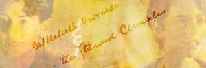
I randomly decided to make an Edmund/Peter WP. Here is the product of my random thought, lol! ^^
Comments are ♥!
~Wunder

"The task of the modern educator is not to cut down jungles but to irrigate deserts." ~ C. S. Lewis, The Abolition of Man
Forum 1.0: 1303 posts
WC: 69
First things first... excellent blending! It's flawless! *major thumbs up*
Really good wallie, WunderLu! I like the images you chose, as well as the coloring; it's very clear and clean looking (if that makes any sense.  ). The font is kinda chunky, and consequently a bit difficult to read, but I like the placement and the text.
  The dark, almost chalkboard-ish background is really good, and the only thing I'm not high on is the rectangles on the left hand side; they seems somewhat out of place, with no real rhyme or reason. I like the notebook texture, though.
All in all, this is a cool wallie, and you did a great job making it! *goes back to geeking out about the blending*
--- flambeau
President of the Manalive Conspiracy
Founder of Team Hoodie
Icon by me
flambeau: Thanks for the lovely comments! Yeah, I guess the text is hard to read, but I was having a hard time finding the right grungy font. I may try fixing that though.
~Wunder

"The task of the modern educator is not to cut down jungles but to irrigate deserts." ~ C. S. Lewis, The Abolition of Man
Forum 1.0: 1303 posts
WC: 69
This is very lovely, Wunderkind_Lucy!  The blending and cropping on all of this is amazing! I like the textured font that you used and the way the letters flow into each other. It almost looks like you used a stamp for the words, since certain letters have less 'ink' on them. I really love the two images you chose of Peter & Edmund, both in their battle suits and armor, and facing directly towards you. The coloring of them is great and the added faded/misty effect that runs over them is a nice touch!
I agree a bit with Flambeau though about the rectangles on the left hand side of the background. I think they distract a little from the image, particularly when you look at Edmund. Personally, I'm not too keen on the binding running down the middle; it's just a little too white and contrasts too much from the overall wallpaper, as well as from Peter because he is partially layered over it. That's just my opinion though.
Aside from that, really nice work! 

We have nothing, if not belief.
—C.S. Lewis
Great job  I agree with Flambeau in that the text is a bit difficult to read, but overall I love it. Well done!
Wrong will be right when Aslan comes in sight / At the sound of his roar, sorrows will be no more / When he bares his teeth, winter meets its death / And when he shakes his mane, we shall have spring again
Cool wp!  I guess I'll have to be odd one out because I really like the squares! The text is a cool touch--more like a texture than text. The binding is ok...maybe a little random but still cool. Awesome choice of pics! The layout is good...although moving Peter a bit closer to Edmund might balance things out better. or even just moving Edmund closer to Peter so that Peter isn't the only thing center. Love the overall look though!
  You should do a girl version with Lucy and Susan.
I love it, wunder! 
And personally, I like both the squares and the binding. They give it a very scrapbook type feel. But maybe that's just me?
Anyway, I love the colouration, text (words AND font -which I can read, by the way-), and blending! Overall, very well done! 
I second AA's motion to make a version for the girls.
p.s. I wouldn't change a thing. This wallpaper is perfect.
Thanks for the lovely comments everybody!
I think I'm going to redo this wallpaper with everyone's comments in mind before doing a girls version of this one!
~Wunder

"The task of the modern educator is not to cut down jungles but to irrigate deserts." ~ C. S. Lewis, The Abolition of Man
Forum 1.0: 1303 posts
WC: 69
Ooh! Gorgeous Wunder!!  I actually like the font that requires a second look to read it.
  It just adds another design aspect to the piece. I don't mind the squares either, though I agree they probably aren't necessary. The only thing about the wallpaper that bothers me in the slightest is the binder. It's a little random, but it's more the bright distraction of it that kinda draws the eye away from the boys.
But really! I love this!!  I can't WAIT to see what you do with the re-do!
![]()
Sig by me | Av by Ithilwen
There is no such thing as a Painless Lesson
Cool wallpaper! I like how Peter and Edmund have cut out and have a slight glow. What did you use as a background?

Design by Narnian_Archer
My Portfolio website


