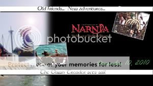
I made this upon request and DiGoRyKiRkE gave me permission to share it. 
A first for me. A wallpaper specifically for a laptop. I should have it up on my website soon. As this is a first in the widescreen department, suggestions, criticisms, advice? I'm going to be going to two sizes of wallpaper on my website from here on out, so I want to make sure I have the proportions correct.
Nice wp starkat. Hmm, I should know the proportions for a widescreen laptop screen, but I honestly couldn't tell you the exact size off the bat. It looks a little narrow (top to bottom) to me, but I couldn't say for sure (I'm not an expert on the subject). Anyway, on to the actual piece. Your choices of imagery work well for the concept of the piece. The "photo frame" idea looks good for the two smaller images and the larger image off center also looks good (the softened edge here is a nice touch as well). I'm not sure on the actual layout of the images though. The eye does seem to go back and forth between them and the lopsided effect helps as well. I'm just not sure on how I feel on the overlap (one goes under the top text "bar" while the other covers DT image pretty well). I couldn't say for sure, because I'd have to actually see it, but I kind of feel that the Eustace image should be slid under the bottom text "bar" (as the top is) and slid over to the right a tad bit more (perhaps as a continuity element). Your choice of text also works well with your choices of imagery both in context and font (although the "d" in Dawn looks like an "o"  ). The title text works really well in promoting the release of VDT and, of course, the inclusion of the title is a must. I'm not sure on why the release date text is colored green. There is a bit of green in some of the water and in Gumpas's clothing, but it comes off as a bit of a shocker to me in the text. It's probably cliche, but I feel like it needs to be a matchup to the water in a blue or blue-green tone, to really pull the color out of the imagery as well (I know, everyone does the water theme for VDT). Definitely an effective promo. piece. Nice work
  .
.

Sig by Dernhelm_of_Rohan
NWsis to eves_daughter & ForeverFan
Thanks Lion's Emblem. Tis much appreciated.  Now to find the time to work on another desktop to improve upon.
Very nice starkat! Good implementation of the light filter. What is the script called?

Quod Erat Demonstrandum
Beautiful Starkat!! I love the two pics, posted in frames and the Logo is very nice!! where did you get that??? I really like the white lines with text and the large picture of the ship. Good job!

Loyal supporter of Caspian/Susan.
NW Family: Aunty Vi, LadyC, Rose, Chloe
Secret Order of the Swoosh.
Keeper of the Secret Magic
L6


