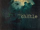
I made this wallpaper a couple of months ago, but forgot to ever post it. 
I think that I'm fairly pleased with how it turned out. I'm not sure if the combination of concept art with actually movie images is odd or not, but I liked the concept art and it looked really bare with no other images on it. As for the text, it was all I could come up with.
Hmmm, I just looked at it again and I think that the scratchy texture might be a little distracting.  (why do I never notice these things until after I've saved them and deleted the project files????? Why??)
Comments would be appreciated! I also appreciate constructive criticism!
Thanks!
--- flambeau
President of the Manalive Conspiracy
Founder of Team Hoodie
Icon by me
I absolutely love it...you captured the essence of the scene! Very nice job! 
"We have nothing if not belief"
Actually i like the scratchy texture. 
and you did very good blending the concept art with the movie images. 
My Graphics Site
Council of Elrond - Best LOTR forum
Aliit ori'shya tal'din. ~ Mandolorian Proverb
Auta i lóme; Aurë entuluva. ~ Quenya
I really like your wallpaper!  The art & movie images together look really good I think!
  What software do you use to make you graphics?
Avatar & sig made by me.
Yes, the concept art/movie scene mix works great. Good job with the coloring and positioning of all the elements. It all comes together nicely. The old photograph effect with the scratches looks good.
"In the end, there is something to which we say: 'This I must do.'"
- Gordon T. Smith
avi by Flambeau
Thank you greenbird37, Eruceninde, LadyGrace, and Adeona for the comments!! 
I absolutely love it...you captured the essence of the scene!
Thank you! I'm glad it came across well. 
Actually i like the scratchy texture.

Lol! Thanks! I'm glad someone did! 
What software do you use to make you graphics?

I use Gimp. 
Good job with the coloring and positioning of all the elements. It all comes together nicely.
Thank you so much! I had some trouble with the layout while I was making it, glad you like it! 
Thank you all again!
--- flambeau
President of the Manalive Conspiracy
Founder of Team Hoodie
Icon by me
I really like this wp flambeau  . Design and layout look good. Coloration throughout is fantastic and really sets up a strong mood for the piece. Your choices of imagery for the concept of the wp are perfect. Everything is blended together flawlessly. I really like how you have chosen to work with concept art as well as film stills to create a new look. It just really feels like a another view of Narnia (not too movie and not book) and that's what I really like about this piece. I don't find the "old time scratches" distracting at all. I think that it just adds a little extra design to it. Text also works well with your choice of imagery: in context, coloration, font, and layout. The spacing between "raid on the" and "castle" may be a bit tight, but who's counting? Nice work
  .
.

Sig by Dernhelm_of_Rohan
NWsis to eves_daughter & ForeverFan
Wow, an absolutely amazing piece of work! Splendid, the construction, the coloring, the elements used and the feeling of the troops sneaking up in the dark - amazing! Once again, you've made all my graphics look lame! A great, great wallpaper! 
I've seen the movie 9 times!!! (PC)
I've seen the movie 7 times!!! (VoDT) And loved it!
Proud member of the C+S club
Av & sig by me
That's so awesome!!! LOVE IT! The scratchy texture looks fine. Could I please ask how you blend pics together so well, and where you get all the WP textures from? Also what is that font? Sorry, I know it's a lot of questions but I would kind of like to get into making wallpapers, and I found this great pic to do one with but to be honest I have no idea how to start and am afraid of butchering the picture. 


Go Marina Erakovic!
I've met Michael Apted!!!
Av & Sig by Me. NWeb sis: ForeverFan
Thank you Lion's Emblem, Beginte, and H.M. Swanwhite for the comments!!
Lol! It seems that everyone else likes the scratch texture.  *finds that amusing*
I really like how you have chosen to work with concept art as well as film stills to create a new look. It just really feels like a another view of Narnia (not too movie and not book) and that's what I really like about this piece.
Thank you! I love working with concept art images, but that particular image wasn't quite big enough to use by itself, and I couldn't find any other Night Raid concept art (hence the choice to use movie images).
Once again, you've made all my graphics look lame! A great, great wallpaper!

Aww, you're sweet, but that would be impossible! You're graphics are simply stunning!  I love your style!
Could I please ask how you blend pics together so well...
I just posted a tutorial here explaining how to blend images (using this wallpaper as an example). I hope it helps! Feel free to PM me if you still have any questions about it. 
...and where you get all the WP textures from? Also what is that font?
Most of the wallpaper textures that I have were from the tutorial thread on the old forum. However, if you go to this site and search for 'wallpaper textures' it brings up a lot of good results!
I fairly certain that the font is called 'Fox Script'. I got it at dafont.com. 
Sorry, I know it's a lot of questions but I would kind of like to get into making wallpapers, and I found this great pic to do one with but to be honest I have no idea how to start and am afraid of butchering the picture.


Don't worry about it! I'm glad to help!
I look forward to seeing what you come up with! Feel free to PM me with any questions. 
Thank you all again!
--- flambeau
President of the Manalive Conspiracy
Founder of Team Hoodie
Icon by me
Add me to the list of people who like the scratchy texture! Do you mind posting it?  I love the entire wallpaper! The blending is amazing and I love the concept art combined with the movie stills!! *saves*
She hoped to be wise and reasonable in time; but alas!
She must confess to herself that she was not wise yet.
Call me Maddy! | my livejournal
Proud Attolian Recruiter
Well, I, for one, think that the scratchy texture goes quite well.  absolutely, fabulously amazing job. I love the idea of combining art and picture, and it worked extremely well.
  I love it!

av/sig me
Narnia Nuts in NH Club
Aim at heaven and you will get earth thrown in. Aim at earth and you get neither. ~C.S. Lewis
Thanks for all your help flambeau!!!
For the tut and that site - I'll have to check that out! And BTW that font isn't Fox Script, at least if it is it's not from dafont.com.
I'm still really nervous about making one though, especially after seeing one like that!!!!

Go Marina Erakovic!
I've met Michael Apted!!!
Av & Sig by Me. NWeb sis: ForeverFan
Thank you Maddy, lilsis, and H.M. (again)!!
Add me to the list of people who like the scratchy texture! Do you mind posting it?

Not at all! Here you go!
I love the idea of combining art and picture, and it worked extremely well.

Thank you!! 
And BTW that font isn't Fox Script, at least if it is it's not from dafont.com.
Sorry, here's the link. It is from dafont.com, but I didn't realize that there wasn't a space in the name.
Thank you all again!
--- flambeau
President of the Manalive Conspiracy
Founder of Team Hoodie
Icon by me
AWESOME WALLY FLAMBEAU!!! The blending is flawless!!!! The color and choice of pics is superb. I think the scratchy texture looks good, it maybe be a little distracting but I still like it!!!!! You make such nice things! 
I very much like the tiny text you put in and the castle is so pretty in the back round. The picture of Peter jumping gives it such a dramatic feel!!! Really good job!! Five stars!!!!
(Would you mind if I used it for my desktop some time??)

Loyal supporter of Caspian/Susan.
NW Family: Aunty Vi, LadyC, Rose, Chloe
Secret Order of the Swoosh.
Keeper of the Secret Magic
L6

