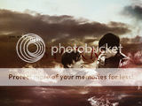
Recently, I have been experimenting with the masking tools on Gimp and finally discovered exactly how to use the tool. Thus, I decided to make a wallpaper using my new knowledge. Using blending and textures, I created a montage revolving around Peter and Edmund.
If anyone needs a smaller sized wallpaper, I'd be happy to create one for you. Constructive Criticism is welcome. I'd love hear what everyone thinks. 
Edit:
Since Lion's Emblem was curious what the words looked like higher, I decided to raise them to see as well. Here's a second version with the words slightly higher. Here's the result.

Avatar is by me
This is simply lovely loper!!
I love the effect with the cloudy sky sort of swirled around them! The text is perfect (and fits the design excellently!)! Wonderful choice of imagery too!
I could go on and on, but in short: great coloring, great design, great wallpaper!
Very well done!  You should be very proud of this wallpaper!
--- flambeau
President of the Manalive Conspiracy
Founder of Team Hoodie
Icon by me
Nice wp loper42. Your choice of text is perfect for your choice of imagery: in context, coloration (great emphasis on 'light' and 'storm'), and font. It's a subjective thing, but I'm not sure on all the negative space at the top of the piece. I can see it as being a "break in the clouds" and matching up to the theme of "light" in the text, but I'm still not sure on it (seems to be a tiny bit distracting at times). It's your call though, I think it's just me. I like the idea of "storm" being the largest word and being placed behind the image of Peter and Edmund. Another subjective thing, but I wonder if too much of the letters are covered. It's my personal feeling, but I would like to see how the text would look in relation to the imagery if it were raised just a little higher. Lighting and contrast levels are superb, really push the mood of the piece. The blending of the imagery within the storm clouds is flawless. Nice work  .
.

Sig by Dernhelm_of_Rohan
NWsis to eves_daughter & ForeverFan
Woah! Great wallpaper!
The quote is great and like others have said great picture and I love the texture! I like how you put the word light in a white/light color! The picture of Ed and Peter are perfectly blended into the clouds. It doesn't look awkward or out of place! Great job! 
Lovely wallie loper! I have always admired your designs ever since I first came to NWeb. *smile*
I absolutely love the cloudy storm effect around them. To me the blending is seemless. Putting the large "storm" behind them is a geat idea to have them still be the center of attention - good color as well, of text and overall clouds/picture.
As for the other words, I'd have made them a bit bigger, but that's really personal preference. To me they seem a little pixelated also. That might be because the wallie for me was shrunk on your photobucket and I could not click on it to make it bigger.
Did you make it that small originally? Or did the site shrink it? I'd like to save it, but I want the biggest version possible...

The *official First Follower of Aslan
Keeper of Susan's Grey Coat.
Avy:Badger
Sig:Beautiful_ltdwn
Masterfully done, loper42! I love the clouds, and the warm colours! The contrast is set perfectly, and I don't think you could do a single thing to improve it.
Well done.
Member of Ye Olde NarniaWeb
Lovely wallie loper! I have always admired your designs ever since I first came to NWeb. *smile*
I absolutely love the cloudy storm effect around them. To me the blending is seemless. Putting the large "storm" behind them is a geat idea to have them still be the center of attention - good color as well, of text and overall clouds/picture.
As for the other words, I'd have made them a bit bigger, but that's really personal preference. To me they seem a little pixelated also. That might be because the wallie for me was shrunk on your photobucket and I could not click on it to make it bigger.
Did you make it that small originally? Or did the site shrink it? I'd like to save it, but I want the biggest version possible...
Thank you! It means a lot. When it comes to the text. What I was trying to do was create a contrast between storm and the other words, so I made the other words really small. I'm not sure if they're too small... hmmm... well anyway thank you very much! 
You probably couldn't see it because the actual wallpaper is pretty big. Here's another link to the wallpaper, hopefully you will be able to see this one better. Just click to see the full size. (Btw: I have a version with the text slightly higher up top) 
Avatar is by me
wow! amazing job! Your coloring is amazing, I love the blending you used with the clouds. I am truly truly impressed 

av / sig by me, PM if you want one
saw the movie opening weekend and cried at the end!
Jesus DIED for ME and YOU!
Wonderful wallie!! The effect of the clouds is amazing. 
Personally i would use a different font for the words 'You are the light' but still a fantastic job. 
![]()
Avatar & Signature by Me
This is sooo good 


One of the best wallies I've seen on here! Do you mind if I use it?

" We have nothing if not belief"
This is really amazing. I love your use of text and textures together with the picture. it's really amazing.

Sig by Me avy by thatonebrunette
triplets with Kate/NL101
This is sooo good


One of the best wallies I've seen on here! Do you mind if I use it?
Hey, sure you can use it! Sorry this is kind of a delayed response. 
Avatar is by me
Those are absolutely amazing!!!! The stormy clouds around Peter and Ed, the text, and the coloring are all so perfect. also that is one of my fav scenes! REally fantastic job 


or have you forgotten who really defeated the White Witch,Peter~Lucy

Avvie,sig:me!
This is a very good wallpaper!! Wonderful look of texture...the clouds are so nice. I ADORE your big red storm behind the boys. It's such a good idea. Edmund is always there for him.  VERY VERY good!!
 Nice color!!

Loyal supporter of Caspian/Susan.
NW Family: Aunty Vi, LadyC, Rose, Chloe
Secret Order of the Swoosh.
Keeper of the Secret Magic
L6


