After a brief HHB detour, I'm back to SC campaign "Let him lift his visor in 2013" 
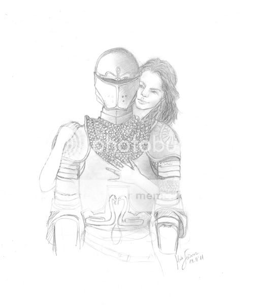
A poster-like concept drawing, a sketch with several detailed places, not meant to be super finished  It's more of a concept of one of the drawings I'll be working on sometime in the future, and what I'd love one of the posters to include/look like.
To be perfectly honest, I don't much like how it turned out from the technical side. I don't like the porportions, I don't much like LotGK's face (almost no personality on her face, someting I detest), I'm only satisfied with the concept. I wanted her to be wrapped around him like a snake, and the concept of it is OK here, even though the wacky proportions are a little off... sigh...
I like the idea of it though. She's supposed to be snake-like around him, possessive in a snake-ish way, sly and rather attractive at the same time. I like to think the sense of addiction of Rilian's is complex, not only the Silver Chair, but also a sense of attraction (not a simple one) caused by the brainwashing, quite like Edmund's to White Witch can be seen as.
Anyway, I plan for the next ones to be better, and meanwhile I hope this one isn't too eyesore 

Comments are great! Please be easy with critics though, I don't like it too much enough as it is 

I've seen the movie 9 times!!! (PC)
I've seen the movie 7 times!!! (VoDT) And loved it!
Proud member of the C+S club
Av & sig by me
Don’t be so hard on yourself Beginte, this is Great! 
I don’t know what it is but there is something snake like about Lady of the Green Kirtle's face (which is good) I really Love her hair! 
And you definitely nailed the snake like way she is around him, very snake like indeed.
I Love the positioning of them and as always Rillian’s armor is awesome!  I Love how consistent you are with his armor.
And this would make an awesome poster for the movie! 
Are you planning on coloring it? 
Great Job! 


The Value of myth is that it takes all the things you know and restores to them the rich significance which has been hidden by the veil of familiarity. C.S. Lewis
Thanks...  I'm glad you like it. I just wanted it to look way better, so I'm a bit disappointed, heh. Oh, good, I wanted her to have something snake-ish about her face (the eyes apart, the flat forehead, I don't know), but I liked yours design better, may I take inspiration from it for when I change this drawing for the colored version? Yes, I intend to color it, by the way
  Thanks, I was trying hard to make her wrapped around him in a snake-like way!
  I'm also glad you like his armor, I didn't do it very precisely or didn't detail it much, it's a sketch... details will come in color. Yay, thanks, I wanted to make it poster-like! Thanks again for your comment!

I've seen the movie 9 times!!! (PC)
I've seen the movie 7 times!!! (VoDT) And loved it!
Proud member of the C+S club
Av & sig by me
may I take inspiration from it for when I change this drawing for the colored version?
Oh, please feel free! I’d Love to see what you choose to do with it! Thanks 
I’m always so critical of my drawings, and always can see a fault even when no one else can, so I understand what you are saying when you say you are disappointed, even though I love it and don’t see any thing wrong with it  , You really did do a fantastic and Awesome job!

I can’t wait to see what it will look like in color! 

The Value of myth is that it takes all the things you know and restores to them the rich significance which has been hidden by the veil of familiarity. C.S. Lewis
I think Rilian's armour looks great but the Lady needs quite a bit of work. I felt uncomfortable because she looks so much like a man, I thought she was a man. But this is NarniaWeb, so that had to be wrong.  I think the Lady needs to be very beautiful. As is, sorry to say, she's not. But the Black Knight's armour looks amazing.
Currently watching:
Doctor Who - Season 11
Yiiiiiikes. She's super uber creepy. I can understand why you would like to re-do her... Maybe it would help to use a model to get her face right. Look in the mirror and make faces until you find the right one. Then maybe you'll come across better.
But Anyhow. I think it's amazing. Excellent drawing.
I dreamt that I dwelt in marble halls

<3 As you wish <3
7chronicles, thanks a lot! I'll definitely be inspiring myself with your design of her when I get to color this piece. I'm glad you like the drawing, even though the more I look at it, the less I like it 
Warrior, thanks. Well, though I don't like her, I fail to see anything masculine about her, so you puzzled me there  And like I said, it's more of a concept art, and there you don't pay much attention to face details. Yes, I know she's supposed to be beautiful, and you have no idea how many times I attempted to make her so, before giving up and dismissing this detail in favor of making it a conceptual piece. As per the armor, it looks better in my "Black Knight" topic.
Shy Galadrier, thank you, I consider it a praise since I wanted her to be creepy  But I want to re-do her into beautiful with a creepy touch. She's supposed to be more evil than deceptively sweet here, since she already has the Black Knight. Oh, you've no idea how many models I've used for this... browsed a whole site of portrait photos and nothing. It's because none of them has this 'it' in herself that LotGK has... I think the problem is that also I don't really know how she should look, don't have a precised appearance in my head, hence can't draw her well. Sad. Definitely can't use myself, she's supposed to be beautiful, heh. But I'm glad you like the drawing

I've seen the movie 9 times!!! (PC)
I've seen the movie 7 times!!! (VoDT) And loved it!
Proud member of the C+S club
Av & sig by me
Nice illustration Beginte. Oh, I don't know what you're beating yourself up for on this piece, I find it works on multiple levels. Yes, there are some technical issues (but I'll try not to linger on those comments too much as you yourself have already noted on them), however, let me applaud you on what works.
As always, design and details are great. The 'Black Knight' has a very Narnian feel to him in his armor. His pose is excellent. It's stoic, but stiff, which works (makes one wonder, as Puddleglum does, if there really is anything inside the armor at all). I like the fact that the linework tends to face out at the bottom, adds a nice quality to it. I do have to disagree with you about the Lady of the Green Kirtle's facial expression. I feel it gives off just the right amount of sinister. She's sort of behind Rillian, so he can't see her face. To me, I see it as she doesn't have to pretend with him anymore and appear as a loving and kindhearted person. Behind his back, she can appear more sinister and "snakelike" as she has Rillian in her grip and control.
Now for the anatomy (I know, you're dreading my speech, but it's going to happen). The Lady of the Green Kirtle feels like she's in pieces, just a head and neck with two arms and hands. I don't know how you're setting up the initial linework in your drawing, but don't be afraid to draw through your drawings and overlap lines (it helps in getting the final anatomy and foreshortening down in the final. Not to mention keeping the anatomy believable with the overlap between characters). I know this is just a concpet sketch, so I'll just leave it at that. Ultimately, I didn't get the snake like reference in the posing from looking at the piece. Reading your post, however, did push the concept. I like the idea, but like you, I don't feel that it comes off as strong as it could. Did you do some reseach on snake anatomy or how snakes coil around their prey (perhaps a boa constrictor?)? It might give you some ideas (at any rate, it couldn't hurt).
Nice work on this piece  , it has been a very interesting series to view.

Sig by Dernhelm_of_Rohan
NWsis to eves_daughter & ForeverFan
I think its very good. I love the armor; looks good as always. 
Yes the LoGK can use some work, but it is by no means bad! Having seen your work, I know that you can do even better though. Anyways, for an early sketch, its very good. Please update us if you redo it. I would love to see it. 

Signature by daughter of the King; Avatar by Adeona
-Thanks :]
Keeper of the Secret Magic

