Tutorial Three
Requested by: nobody
Program: GIMP
Start picture:
End Result: 
Crop, Scale, and whatnot to the image.
I’m using a base from the trailer caps that this site posted.
Start by duplicating your base layer, set it to screen at 100%.
Duplicate base layer again, bring it to the top and set it to overlay at 80%

add a layer mask to top layer, copy and paste base layer into mask, invert.
Flatten.
Add a layer of White and set it to soft light at 100% Add a layer mask and copy (ctrl+ C) and paste (ctrl+ V) base layer into mask. Invert (colors>invert)

Flatten.
Duplicate base layer and go to Colors> Hue/Saturation.
Change the saturation only.
Master: 100
Red:100
Blue:100
M agenta:100
Yellow:100
Click ‘okay’.
Set that layer to Multiply at 60%

Flatten.
Go to Filters> Enhance> Sharpen and sharpen to 30
Duplicate your base layer.
Add a fill layer of #ff8ea1 and set to value at 100% Merge down to layer below. Set that layer (the one that you just merged the value layer to) to Overlay at 60%

Flatten.
Duplicate base layer and go to colors> components> channel mixer
Input these settings.
Red: 130, -50. 50
Green: 30, 30, 50
Blue: 30, -30, 140
Make sure that ‘Preserve Luminosity’ is CHECKED.
Merge top layer down down.
Go to Hue/ Saturation again. Input this setting for saturation.
Cyan: -20
Click ‘okay’
Go to Colors> auto> white balance.

That’s it for coloring. 
Okay… on to the textures >.<
Add This texture (by )  and invert the colors. Set it to Lighten Only at 100%
Flatten.
Go to Hue/ Saturation again and input these in the saturation:
Yellow: 60
Cyan: -40
Blue: -100
Now, last, but not least, insert THIS  texture by me, and set it to soft light at 100% Erase the part over His eye.
Add text and whatever else you want and you’re done! 

More examples of this coloring: 


Any questions? Feel free to PM me 
~VFK~
This tutorial was requested by flambeau and is for coloring and combining caps and adding a false background.
I started with this picture of Lucy:

(this and the next 3 images are thumbs. Click for better visibility)
But I wanted to add a background that gave the feeling of being at sea, so I used this cap from the trailer:

I started by cutting Lucy out. For me, the easiest tool to use is the GIMP scissor tool. It uses anchor points and cuts it out for you:

copy and paste onto the other layer:

Crop and resize:

This definitely needs some sharpening. Sharpen however you see fit. I sharpened the first layer to 25 and the bottom to 20.
You can tell that the tones in the two images are very different. I like the sunset tones, so I'm going to try to add some yellows to the top image.
I use curves to do that:
red x:150 ,y:165
blue: x:155, y:135
Basically, just fiddle until the colors match:

At this point, I merge the layers and start to color them together.
Create a new layer, fill with white and set to softlight. This image is already pretty bright, so reduce the opacity to 25%:

Duplicate the base layer, bring to the very top and set to soft light. Too much contrast is bad, so I reduce to 50%:

Honestly, I like that, but the original icon has a rosy purple color, so since that's what we're aiming for, copy visible, paste (or just flatten) and head to curves again:
red: x:145, y:165
blue: x:125, y:150 and x:140, y:197

Apparently, the first time I made it I thought the glow on her face was a little intense, but I like it now. To even out the glow, however, use paintbrush to make a "texture" in a new layer:

use Gaussian blur to blur at 25:

Set to soft light (adjust opacity as needed):

The original is a bit darker and textured, so I'll try to get that effect by filling a new layer with the color #2a093b, set to soft light, erase from parts that are undesirable and blur with gaussian blur at 25. I reduced mine to 40%:

Done! Made in GIMP.

Tutorial #6
Requested by: MissAdventure
Going from this:  to this:
  recreating this:
(Sorry that the cropping isn't exactly the same.)
Crop, scale, and prep your image. Duplicate your base layer and set it to screen at 100%. Add a fill layer of 404040 and put it at lighten 100%. And another fill layer of 140700 and put it on Exclusion at 100%.
Add an adjustment layer of hue/saturation and input these settings: Master Saturation +54
Click okay. In your layers area drag your adjustment layer down below your two fill layers and leave it there. Now add another adjustment layer of hue/saturation and input these settings: Reds +36
click okay. Now duplicate your two exclusion layers. Set the third to difference at 100%. Now the lilies in the water should be bluer and the colors less harsh. Your image should look like this: 
I think that's pretty close. The distance from the longboat in this image could also affect the coloring. Since I didn't really get the cropping quite right it might not look the same.
Your almost done. Add this thin frame around the image: 
Then text. I, in this case added this: 
Then, last but not least, I added this texture by I don't know who:  set this to screen at 100% and maneuver it over the text.
And your done. Any questions feel free to PM me. 
NOTE: If any of the textures I made don't show up on here don't worry once you loud them up in your graphics program they should appear transparent. If they don't try to set them to multiply.

Loyal supporter of Caspian/Susan.
NW Family: Aunty Vi, LadyC, Rose, Chloe
Secret Order of the Swoosh.
Keeper of the Secret Magic
L6
Tutorial #32: How to get this: ![]() From this:
From this: ![]()
A recreation of this: ![]()
Requested by HM Swanwhite and lover of narnia. 
Open your base image. Crop and scale it, if necessary.
Duplicate the base layer, go to Colors>Curves.
Value: x:148, y:197
Leave the red channel as it is.
Green: x:102, y:109
Blue: x:85, y:95
Click 'ok'.
Duplicate that layer, go to Colors>Channel Mixer and use these coordinates.
90, -20, 0
-10, 40, 60
-50, 80, 60
Set that layer on Screen at 50% opacity.
Add three layers of #000d2f and set them on Screen, Screen, Subtract and set the middle layer's opacity to 50% (but leave the other two at 100%).
Flatten all of the layers together.
Sharpen and blur the image, if you like.
Go to Colors>Brightness-Contrast. Brightness: -13, Contrast: +6.
Add this texture:  (I don't know who made it) And set it on Soft Light at 100%. Go to Filters>Blur>Gaussian Blur and blur it to about 20. This makes the line in the texture less defined.
This texture pretty much makes the avatar what it is. 
 (again, I don't know who made it) Set it on Screen at 100%. Flip it horizontally and move it to the left (or whatever your image requires) and then use the blend tool to blend the edge of the texture. (sometimes, if you move a light-texture over, the edge of the texture shows up a little and makes a line. The blend tool helps get rid of that. I hope that made sense!)
You're done! 
Please let me know if you have any questions! 
Do not copy exactly.
~Djaq
When things fall apart, be glue.
Team Hoodie!!
Thanks for that tut Djaq! 
Tutorial #5
Requested by violetfirekrazed and qwertykate88
How to go from this: to this:
Note: the first image is actually what the base looked like after the first step.
Crop your image.
Go to Colors > Auto > White Balance.
Duplicate your base layer.
Open a new layer and add a fill colour of ff8ea1. Set it to Value. Now merge it down and set that layer to Soft Light. (This part of the tut is similar to one of flambeau's colouring techniques.) 
Then add a layer mask. Copy and paste your base layer into the mask and invert it. (Colors > Invert.)
I'm unsure about this next part but I think I duplicated the base layer and went to Colors > Curves. I'm unsure what I set it on but I'm pretty sure it was x:56 and y:94. I kept this layer on normal but lowered the opacity to 32.5.
I added these two light textures (1st one by ? and 2nd by me): 
Setting the first one to 55.3 and the second to 45.9. I moved them around to where I wanted them.
I added this texture (by ?)  I inverted it and set it on Screen at 100 and position it where you want it.
Then add this texture (by?).  I set it on Screen at 9.
Open a new layer and add a fill colour of 404040. I set it on Lighten Only at 53.3.
I believe that is it. Sorry it took me awhile. I had it done on the weekend but didn’t get to put it on so I thought I better post it before I go away.
Enjoy! Any questions feel free to PM me.

Go Marina Erakovic!
I've met Michael Apted!!!
Av & Sig by Me. NWeb sis: ForeverFan
A Tutorial To Get This:

1. Prepare your base
2. Duplicate it twice, and set both layers to screen. I kept the opacity of both layers at 100%, but if it's too bright, you can play around with the setting until you're happy
3. Go to Channel Mixer and put in these settings:
Red: 130, -30, 0
Green: 0, 100, 0
Blue: -25, 45, 100
4. Set that layer to 20.00 or so on the opacity level
5. Flatten your image
6. Take this texture  by luux_lu and paste it into a new layer. This set to multiply. And you're done!
  Enjoy!
(An optional step, but, I added this texture,  , and set it to overlay at about 50% or so to get a bit lighter of a colouring)
Dear days of old, with the faces in the firelight,
Kind folks of old, you come again no more.
(Robert Louis Stevenson)
Made with GIMP
Take This:  To This:
Colors/Auto/White Balance
then duplicate the base and set it to screen 75% opacity
Add three new layers of 170920 and set them to screen, screen, and subtract 100% opacity.
Add a new layer of f0e7ee and set it to burn 100% opacity.
Flatten Image.
Colors/Components/Channel Mixer
Impute these settings:
Red Channel- Red: 179.3, Green: -57.8, Blue: -75.6
Green Channel- Red: -10.4, Green: 96.3, Blue: -13.3
Blue Channel- Red: -51.9, Green: 114.1, Blue: 10.4
All done 

Banner and Avvi by me
Okay, here’s a quick tutorial for brightening up and manipulating the image a bit…. I’m going to be using a picture of Aang from, “Avatar: The Last Airbender” as an example.
Starter image: 
End: 
Okay.... Here we go:
First, open up your image, crop, scale, whatever. 
Duplicate your base layer, set it to screen at 100%
Go to colors>auto>white balance.
Flatten.
Now it looks like this:

Okay, now you're going to add a new layer of white, set it to soft light at 100%. Add a layer mask, copy and paste base layer into mask, invert mask.
Flatten.
Now it looks like this:

Duplicate your base layer, desaturate it (I chose the luminosity option). Noww, invert (colors>invert). Set that layer to overlay at 20%.
Flatten.
Add this texture by?  and set it to soft light at 80%
Now add this texture by?  flip it vertically and set it to soft light at 40%

Next, add this texture by me:  invert the colors, flip it horizontally. With your blur/sharpen tool, blur it at a rate off 100% until there are no distinguishable lines. Set it to soft light at 60%
This is where I added the text....
For said text, I used black letters and set the "To be the" layer at grain merge at 70%.
"Last" was set to grain merge at 60%
FLATTEN.

Now, add this texture by me: 
rotate it negative 90 degrees and set it to multiply at 100% Now, using you blur tool again, blur it as much as you can. 

Okay, now, with the texture selected, VERY carefully mouse over Aang with your erase tool.
Aaaaand, Voirlar, your done 

More examples of this coloring: 


Please do not copy exactly.
Thanks All!
~VFK~
Tutorial #83 - This:  to this:
  using Gimp. Translatable.
Requested by Wunderkind_Lucy.
Open and prep image/base (crop, scale, etc). I started by cropping my image (which is a screencap of Luke Scarlett from Robin Hood. This scene is so good for graphic making! All of my other examples are from the same scene.  ) and then extending the sky to fill the empty space at the top.

Next, I duplicated my base layer and set it to Soft Light at 75%. It is way too contrasted now, but this is necessary because we're going to brighten our image a lot in just a second.
Duplicate your base layer again and bring it to the top. Set it to Screen at 100% and duplicate it so you have two Screen layers. It's much brighter now, and not so contrasted either. 
Flatten your image.

Duplicate your base layer and set it to Soft Light at 100%. Add a layer mask, and copy and paste the background layer into it.
Duplicate your base layer again, bring it to the top and set it to Screen at 100%. Add a layer mask, and copy and paste the background layer into it. Now invert (Colors>Invert) the layer mask.
Flatten your image again.

Add this:  (by ?) set it to Soft Light at 100%.
Add this:  (by ?) set it to Burn at 50%.
Add this:  (by ?) set it to Lighten Only at 100%.
Add this:  (which I made using the idea from Kate's tut. I suggest making your own and using whatever colors you want to make your image look good.) Set it to Soft Light at 100%.
Add this:  (by ?) set it to Screen at 25%.
Add this:  (by ?) set it to Soft Light at 25%.
Flatten your image.

Go to Filters>Enhance>Sharpen and sharpen the image to your liking.
I selected the Blur/Sharpen tool and selectively blurred his face a little bit.

...and that's it! You're done! Add whatever else you want!
Please do not copy exactly.
Note: I use different textures depending on what look I'm going for, but the overall technique stays the same. Change it up however you want to get the look you're going for. 
Other examples of this technique: ![]()
![]()
![]()
--- flambeau
ETA: I just realized that I had credited myself for the fifth texture. I did not make it. Sorry about that!
President of the Manalive Conspiracy
Founder of Team Hoodie
Icon by me
Alright, Wunderkind_Lucy has requested a tutorial and here goes my first tutorial try. At least in the graphics world.  *is slightly nervous*
1) Open base and duplicate it.
2) Though her face is very smooth and her freckles are, in my mind, charming, this is not the look we're going for. So on the duplicate layer, open filters>blur>gaussian blur. Set both the horizontal and vertical to 7 and hit OK.
3) Now, on that blurred layer, take your eraser tool and using the Circle brush erase over her eyes, eyebrows, lips, hair and nostrils. NOTE: There are several different ways to smooth skin, but this is the one I used for this particular wallpaper.
4) Merge these two layers together.
5) Open color>brightness/contrast and set the contrast to 27 and Brightness to 0.
6) Open filters>artistic>Softglow and set the glow radius to 27, the brightness to .23 and the sharpness to .66 then hit OK.
7) Take the blur/sharpen tool and set it to sharpen and go over her eyes and lips three times.
8) Create a duplicate layer.
9) On the duplicate layer grab your dodge/burn tool and set it to dodge, which should be the default. Zoom in to her eye until you can clearly see the pixels and carefully dodge the whites. Don't zoom back out yet!
10) Using the Ellipse select tool, select the region of the iris.
11) Select layer>crop to selection.
12) Carefully erase out the pupil and any of the white still remaining in the cut layer.
13) On the now cut-out iris select the brightness/contrast again and set the brightness to 18 and the contrast to 36.
14) Then go to colors>colorize and set the hue to 197, saturation to 31 and lightness to -13.
15) Go back to brightness/contrast again (I don't know if I did that this many times originally, but this is the only way I was able to recreate it) and set the brightness to 59 and contrast to 3.
16) Merge the layers together.
17) Drag and drop this star texture onto the wallpaper and set to screen.
18) Take your smudge tool and go all over Anna's face. This of course smudges all of the texture out, but leaves the color the same so it doesn't look funny.
19) Drag and drop this sparkle texture and set to screen 18%.
Repeat step 18.
All done!
I realize it's not exactly the same, but it's pretty close. Anyway, with a little tweaking, I'm sure y'all can come up with something way better.  Enjoy!
![]()
Sig by me | Av by Ithilwen
There is no such thing as a Painless Lesson
Tutorial number 5
Made with GIMP.
Going from THIS: to THIS:
Okay, start by duplicating your base layer and setting it to screen at a hundred percent.
Flatten.

Duplicate base layer again and set to white balance. Set that layer to color at 100%.
Flatten.

Duplicate your base layer. Go to Colors> Hue/Saturation and bring the green, blue, cyan and yellow saturation up to a hundred each.
Click okay.
Set that layer to soft light at seventy percent.

Flatten.
We have now sufficiently brightened it 
Okay... now we're going to add textures which effect the lighting in the picture 
Add THIS  by me. Invert the colors. Flip it vertically. Go to Filters>blur>Gaussian blur blur it with a radius of 21. Set it to soft light at 100%.
Add THIS  by me. Rotate it -90.00 degrees. Set it to Multiply. The opacity for this will depend on you image, go with what looks best to you. Now, Filters>blur>Gaussian blur it with a radius of 21.
Flatten.

Add a new transparent layer and paint his white shirt a slightly yellow color (f4e073). Set that layer to color at 30%
Flatten.

Almost done....
Now, add another transparent layer, use a fuzzy brush to paint a dot of this color:efcbf6 on your image. Go to filters>artistic> softglow: Brightness: 35. Set that layer to screen at 80%.

Now just add text and you're done.

~VFK~
GIMP Tutorial #31
Requested by lover of narnia
Translatable.
From this  to this
  , recreating this
  .
.
HERE @ my livejournal. 
Feel free to PM me with any questions you might have. 
Please do not copy exactly.
(And sorry this is so late!  )
)
She hoped to be wise and reasonable in time; but alas!
She must confess to herself that she was not wise yet.
Call me Maddy! | my livejournal
Proud Attolian Recruiter
Double-posting... 
GIMP Tutorial #32
Requested by lover of narnia
Translatable.
From this  to this
  , recreating this
  .
.
HERE @ my livejournal. 
Feel free to PM me with any questions you might have. 
Please do not copy exactly.
-----------
Not double-posting.... 
GIMP Tutorial #33
Requested by lover of narnia
Translatable.
From this  to this
  , recreating this
  .
.
HERE @ my livejournal.
Feel free to PM me with any questions you might have. 
Please do not copy exactly.
She hoped to be wise and reasonable in time; but alas!
She must confess to herself that she was not wise yet.
Call me Maddy! | my livejournal
Proud Attolian Recruiter
Hey!
A Tutorial For GIMP.
(Don't know if it's translatable)
Click on the link:
http://pearlsofweird.livejournal.com/10806.html
Will somebody please PM me if the link doesn't work?
I hope you enjoy the tutorial. 
~Queeny! 
Duracell: the power of 10,000 rabbits in one battery
Member of Edmund's Fan Club!
Ramandu's Daughter Club member!
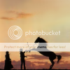
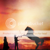
Tutorial #84 - This: 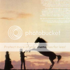 to this:
 ![]() using Gimp. Translatable.
using Gimp. Translatable.
Open and prep image/base (crop, scale, etc). I'm using a semi-low quality image from The Man From Snowy River.

The thing about using low quality images is that while they usually need a lot of coloring to make them look good, too much coloring can actually make the image look worse than it did before, so you have to be careful not to overdo it.
I duplicated my base layer and set it to Multiply at 75%. Then I merged it down. This made the colors in the sky stand out more, and made the silhouettes more dramatic. It also made the text on the image stand out like a sore thumb (I think the image was scanned from the back of a cd case or something, hence the text.), so I then smudged and blurred the whole sky (except for the clouds).
I added some textures next...
 set it to Soft Light at 100%.
 set to Soft Light at 100%.
 set to Soft Light at 75%.
 set to Soft Light at 100%.
 set to Lighten Only at 100%.
 set to Soft Light at 100%.
 set to Soft Light at 50%.
 set to Grain Extract at 100%. Duplicate that texture and set it to Grain Merge at 100%.
Flatten your image.
Lots of textures there, but they helped me to control the lighting and coloring of my icon without actually altering the image coloring. With low quality images, that is a must!
I went to Colors>Components>Channel Mixer and input these settings...
And as a final touch, I added a few more textures...
 set to Screen at 100%.
 set to Screen at 100%.
 set to Screen at 100%.
... and that was it! 
![]()
I hope this tutorial was somewhat helpful!
Please do not copy exactly.
The majority of the textures in this tutorial were edited by me, but I did not make them, and cannot take credit for them.
--- flambeau
President of the Manalive Conspiracy
Founder of Team Hoodie
Icon by me


