Tutorial #71 - This: ![]() to this:
to this: ![]() using Gimp. Translatable.
using Gimp. Translatable.
Open and prep image/base (crop, scale, etc.).
Duplicate your base layer and set it to Soft Light at 100%.
Duplicate your base layer again, bring it to the top and set it to Screen at 100%.
Flatten your image.
Now, we're going to do the same thing again...
Duplicate your base layer and set it to Soft Light at 100%.
Duplicate your base layer again, bring it to the top and set it to Screen at 100%.
...and flatten your image.
Go to Colors>Desaturate, and select the Luminosity option. Your image will now be black and white.
Duplicate, set to Screen at 25%. Merge it down.
Go to Colors>Brightness-Contrast and input these settings: +5, +5.
Go to Filters>Enhance>Sharpen and sharpen the image to your liking.
I selected the Blur/Sharpen tool and selectively blurred his face and sharpened his eyes.
It currently looks like this: ![]()
Add this:  set it to Soft Light at 100%.
Add this:  set it to Lighten Only at 100%. I moved it over to the left a bit, and then erased the parts that covered his face.
Add this:  set it to Hard Light at 100% (if this layer mode doesn't look good with the image you're using, try setting it on Soft Light instead.).
...and that's it! Add whatever else you want! ![]()
You're done! 
campgirl requested a tutorial on this avi: ![]() it was made with this same technique, except I changed the opacity on the last two textures to 50%, instead of 100%.
it was made with this same technique, except I changed the opacity on the last two textures to 50%, instead of 100%. 
Please do not copy exactly.
--- flambeau
President of the Manalive Conspiracy
Founder of Team Hoodie
Icon by me
Tutorial #50—White and Green Coloring
Made in PSPX
Going from this:  to this:
Wow! My 50th tutorial! *throws confetti*
PM me if you have any questions!
~Wunder

"The task of the modern educator is not to cut down jungles but to irrigate deserts." ~ C. S. Lewis, The Abolition of Man
Forum 1.0: 1303 posts
WC: 71
Tutorial #72 - This:  to this:
 ![]() using Gimp. Translatable.
using Gimp. Translatable.
The first couple steps of this tutorial are identical to my previous tutorial.
Open and prep image/base (crop, scale, etc.).
Duplicate your base layer and set it to Soft Light at 100%.
Duplicate your base layer again, bring it to the top and set it to Screen at 100%.
Flatten your image.
Now, we're going to do the same thing again...
Duplicate your base layer and set it to Soft Light at 100%.
Duplicate your base layer again, bring it to the top and set it to Screen at 100%.
...and flatten your image again.
Duplicate your base layer and go to Colors>Components>Channel Mixer and input these settings...
set it to Screen at 50%.
Add this:  set it to Soft Light at 100%.
Add this:  set it to Lighten Only at 75%.
Add this:  set it to Soft Light at 100%. Duplicate it and set it to Hard Light at 50%.
Flatten your image.
It now looks like this: 
I then tweaked the color of his hair slightly 'cause it was a bit too red for my tastes: 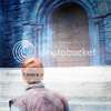
As a final touch, go to Color>Hue-Saturation and set the Master saturation to +10.
It now looks like this: ![]()
Add whatever else you want!
You're done!
Another example of this coloring: ![]()
Please do not copy exactly.
--- flambeau
President of the Manalive Conspiracy
Founder of Team Hoodie
Icon by me
Tutorial #73 - This:  to this:
 ![]() recreating this:
recreating this: ![]() using Gimp. Translatable.
using Gimp. Translatable.
Requested by campgirl.
This tutorial is similar to my 69th tutorial, but several of the steps are different. 
Open and prep image/base (crop, scale, etc.).
Duplicate your base layer, go to Colors>Auto and select White Balance. Set that layer on Screen at 100%. Merge it down.
Duplicate that layer, add a fill layer of color #ff8ea1, set it to Value at 100% and merge it to the background layer. Set that layer to Soft Light at 100%.
Add a fill layer of color #cbd1f1, set it to Burn at 100%.
Add three fill layers of color #000d2f, set them to Screen, Screen, and Subtract, all at 50% (on other programs, you can add one layer of that color and set it to Exclusion at 50%.)
Flatten your image.
Duplicate the base layer and go to Colors>Components>Channel Mixer and input these settings...
Red channel: +120, -40, +10.
Green channel: -10, +50, +70.
Blue channel: -40, +50, +100.
Make sure that Preserve Luminosity is unchecked. Click ok. Set that layer to Color at 50%. Merge.
Add a fill layer of color #2a1409, set it to Screen at 100%.
Add a fill layer of color #000d2f, set it to Soft Light at 50%.
Flatten your image.
Go to Colors>Curves. Input these settings in the Value Channel...
Point 1: x = 123, y = 134 | Point 2: x = 151, y = 168.
Duplicate your base layer and go to Colors>Levels, input these settings...
Value: 0, 1, 251. 0, 247.
Red: 0, 1, 246. 5, 255.
Green: 15, 1.14, 245. 0, 241.
Blue: 0, 0.92, 255. 24, 255.
Click ok. Set that layer to Screen at 75%.
Flatten your image again.
Go to Colors>Color-Balance and input these settings...
Shadows: +5, +5, +10.
Midtones: 0, 0, 0.
Highlights: -5, +10, 0.
Make sure Preserve Luminosity is unchecked.
Add a fill layer of color #ffffff, set it to Soft Light at 25%. Add a layer mask, copy (Ctrl+c) and paste (Ctrl+v) the background layer into the layer mask. Now invert (Colors>Invert) the layer mask.
...and you're done! Add whatever else you want! On the original, I sharpened the image, then selectively blurred their faces, and also tweaked the color of Robin's face so it wasn't quite so red. I was too lazy to do all of that on the recreation. 
Enjoy!
Please do not copy exactly.
--- flambeau
President of the Manalive Conspiracy
Founder of Team Hoodie
Icon by me
Tutorial #74 - This: ![]() to this:
to this: ![]() recreating this:
recreating this: ![]() using Gimp. Translatable.
using Gimp. Translatable.
Requested by Wunderkind_Lucy.
Open and prep image/base (crop, scale, etc.).
Duplicate your base and set it to Screen at 100%.
Add a fill layer of color #2a1409, set it to Subtract at 100%.
Flatten your image.
Go to Colors>Components>Channel Mixer and input these settings...
(by me) set it to Lighten Only at 100%.
Add whatever else you want! You're done!
Please do not copy exactly.
--------------
Tutorial #75 - This: ![]() to this:
to this: ![]() recreating this:
recreating this: ![]() using Gimp. Translatable.
using Gimp. Translatable.
Requested by Wunderkind_Lucy.
Open and prep image/base (crop, scale, etc.).
Duplicate your base layer and go to Colors>Components>Channel Mixer. Input these settings...
(by me) and set it to Lighten Only at 100%.
Add this:  (by me) and set it to Lighten Only at 100%.
Add whatever else you want! You're done!
Please do not copy exactly.
--- flambeau
President of the Manalive Conspiracy
Founder of Team Hoodie
Icon by me
Tutorial #2 (requested by Wunderkind_Lucy) Made using GIMP; may be translatable.
Going from this:  to this:
  , recreating this:
  (I could not get the recreation exact, sorry)
Open your image and crop/scale, etc. I used one of Gymfan’s bases from spareoom.net.
Duplicate the base layer and set to Screen at 100%. Duplicate the base layer again and set to Hard Light at 70%. Position that layer between the base and Screen layers.
Add a fill layer of #0b0b41. Set to Screen at 100%. Duplicate twice: set the third layer to Subtract at 100%.
Add a fill layer of #dcedfe, set to Multiply at 100%.
Add two fill layers of #fef1dc, set both to Multiply at 100%.
Merge layers.
Using the rectangle select tool (in the upper left corner of the toolbox), draw a rectangle over the sky. It needs to go out to the edges of the base and end where the sky touches the mountains.
With the fuzzy brush, paint over the rectangle with #dcedfe. Set to Overlay at 100% and click on Select>None. Using the Smudge tool, carefully blend the edge of the rectangle into the mountains.
Merge.
Add a fill layer of #dcedfe, set to Multiply.
Add a fill layer of #b5b5b5, set to Overlay at 100%. Add a layer mask, copy and paste the base layer into it.
Flatten image. Go to Colors>Hue-Saturation and input these settings: Red: 100, Green: 30, Blue: 20, Cyan: 20. Set the Master hue to 7 and the Master saturation to 20.
Add a fill layer of #b5b5b5, set to Overlay at 100%.
Add a fill layer of #636363, set to Overlay at 100%.
Flatten image again; duplicate base layer and go to Colors>Hue-Saturation. Set the Master at 10, Red at 100 and Green at 10. Flatten.
Duplicate layer and go to Filters>Blur>Motion Blur. Set it to Zoom with both X and Y at 55 and the length at 58. Add a layer mask and carefully paint with #000000 over Lucy and the area under the arch.
Add a layer of #636363, set to Grain Extract at 20%. Add a fill layer of #fef1dc, set to Grain Merge at 10%.
Flatten image.
Sharpen to 30. I also blurred the sky at 50% opacity.
Add whatever you like! I added this texture  set to Screen at 100%, and some text.
And you’re done! 
PM me if you have any questions!
Please do not copy exactly!
the light after the storm
shows that hope was never gone
Snow After Fire graphics
Tutorial #30 (!!): How to get this: ![]() From this:
From this: ![]()
A recreation of this: ![]()
Requested by malkah. 
Open your base. Duplicate the base layer twice. Add a layer of #ff8ea1 and set it on Value at 100% opacity. Merge down. Set the merged layer on Overlay at 100%.
Add a transparent layer and fill it with #dcedf6. Set that layer on Burn at 75%.
Add three layers of #000d2f and set them on Screen, Screen, Subtract. Leave the opacities of the Screen layers at 100, but set the Subtract layer to 85%.
Flatten all of the layers together and sharpen the image.
I used the Rectangle Select tool to create a "box" over the image at the top since it isn't tall enough. After I selected the are I wanted, I opened a transparent layer and filled the selection with #f6e6d8. I added tiny-text in the font Trajan Pro, size 1.
Add this texture:  (by bambinainnero) Set it on Overlay at 100%. I scaled the layer up to 125x125 and moved it around to where it looked the best.
You're done! 
If you have any questions, feel free to send me a PM.  Enjoy!
Please do not copy exactly.
~Djaq
When things fall apart, be glue.
Team Hoodie!!
Tutorial #4. Requested by: Wunderkind_Lucy
Going from this: To this:
Recreating this: 
Start with your image, I used a base from dont_be_so_base. Crop, scale, resize.
Then go to image, adjustment's, auto levels. This will brighten up they image, and remove it's yellow tint.
Duplicate your base layer and set it to Screen at 100%. With that layer still selected, go to image, adjustments, hue/saturation. Then input these settings:
Master saturation: +23
Reds: +19
Yellows: +11
Greens: +16
Cyans: +18
Blues: +10
Magentas: 0
Then Click 'Ok'.
Next go to Image, Adjustments, Channel Mixer. Input these settings:
Output channel Red: Red; 139 Green; -85
Then click okay. Next go to Image, Adjustments, Brightness/Contrasts and input this setting.
Brightness: +44
Click okay. Now return to Image, Adjustments, Channel picture and input these settings: Red output channel: Green -10.
Blue output channel: Red-10 green +27
Click okay and your done!!! I took my blur brush and blurred her skin lightly. Go ahead and add whatever ever you like! Hope it looks okay. Pm me if you have any questions.
--------------
There is one tut Wunder_Lu! I promise to do they others soon!! 
Loyal supporter of Caspian/Susan.
NW Family: Aunty Vi, LadyC, Rose, Chloe
Secret Order of the Swoosh.
Keeper of the Secret Magic
L6
Going from this:  to this:
1. Add this texture by ?  and set it to soft light, 100% opacity.
2. New Curves Layer:
RBG:
Input: 127
Output: 147
RED:
Input: 107
Output: 106
GREEN:
Input: 115
Output: 117
BLUE:
Inupt: 113
Output: 117
3. Add this texture by ?  and set to screen, 15% opacity.
4. Levels Layer:
RBG:
Input Levels:
13, 0.83, 241
RED:
Input Levels:
0, 0.97, 255
BLUE:
Input Levels:
0, 0.97, 255
5. Add this texture by ?  and set it to soft light 100% opacity.
6. Merge all your layers.
7. Duplicate the base and set it to soft light, 100% opacity.
You are done! 
This tut doesn't work with all images. You may have to experiment with opacitys to get a good looking avi.
Proud member of the Hawk Nelson Club!
Avi by filmowe on livejournal.
Here is a tut for a new technique I discovered recently.  Kind sorta requested by Flambeau.
Open your image: crop, scale and shape to your liking. Next go to image: Adjustments, auto levels, or white balance in Gimp. Duplicate your base layer, and set it to Screen at whatever percent fits your image. Next open this  texture by Flambeau and set it to Lighten and whatever percent fits your image. Generally 100%.
Next duplicate your base layer again and bring it to the top. Then go to filter: blur: motion blur. Angle 0. Distance: 10 pixels. Then click ago. Now your image is all fuzz and really kinda dizzy. Bring the opacity down to around 25%. Now your image is shimmery and soft.
Reselect your base layer and add what ever coloring you like and your done!  You can also sharpen and blue the image to your like.
Examples of this technique: 


Hope it's just a bit understandable. 

Loyal supporter of Caspian/Susan.
NW Family: Aunty Vi, LadyC, Rose, Chloe
Secret Order of the Swoosh.
Keeper of the Secret Magic
L6
Tutorial #5
From this: 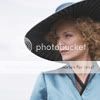 to this:
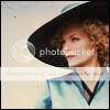
For Photoshop, but perfectly translatable.
1. Pick your image, scale, crop, etc.
2. Duplicate your base twice (have 3 identical images one on top of the other).
3. The top layer - blend, set on 'screen', opacity 77%.
4. Merge down.
5. Top layer (after merging) - blend, set on 'overlay', opacity 100%.
6. Flatten your image.
7. Take this texture: 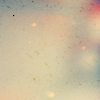 (I don't know whose work it is, unfortunately!), blend, set on 'multiply', opacity 65%.
8. Flatten image, add frames and done 
Handy tips - you might want to smoothen out some parts using the blur tool, also lighten some other bits by using your light brush.
Have a nice working! 
I've seen the movie 9 times!!! (PC)
I've seen the movie 7 times!!! (VoDT) And loved it!
Proud member of the C+S club
Av & sig by me
Tutorial #6
Requested by HM Swanwhite
Coloring tutorial in Photoshop, translatable and simple 
From this:  to this:
  recreating this:
1. Pick image, scale, crop, etc.
(1.5). In this case it wasn't needed, but in others turn your image almost entirely black&white.
2. Brighten your image to desired level - in this case, it wasn't needed much, as the contrast is already big. You can do it by choosing 'levels' and setting the adjustments by a zipper, or taking a light brush and doing it 'manually' 
3. Go to Layer -> Color balance: Red: -53, -17, 0
Green: 0, 0, 0
Blue: +52, 0, 0
Make sure to have the 'keep luminoscence' checked.
The color balance setting is for this particular av, you normally adjust it to your liking.
Handy tip - you might also take your B&W brush, set it on around 20% opacity and touch the picture several times, to lower the intensity of your blue coloring.
4. Flatten your image. Choose color #ECCB9F, set on 'multiply', opacity 85%.
5. And you're done 
The color balance, choice of filling color, the contrast between lights and shadows all varies depending on your personal preference.
I hope I didn't tangle it too much 

I've seen the movie 9 times!!! (PC)
I've seen the movie 7 times!!! (VoDT) And loved it!
Proud member of the C+S club
Av & sig by me
Tutorial #28
Made in GIMP, but should be translatable.
Requested by HM Swanwhite and lover of narnia.
This is a general kind of how-to on how I make the backgrounds for my quote signatures. I apologize in advance for how roundabout and convoluted this tutorial may sound (not to mention being about three weeks late!  ). If you have any questions, please PM me, I'd hate to think I'm being helpful, but am actually stirring up confusion.
lover originally asked for this signature, but due to losing the file, I've done it on this one.
Here at my livejournal!
She hoped to be wise and reasonable in time; but alas!
She must confess to herself that she was not wise yet.
Call me Maddy! | my livejournal
Proud Attolian Recruiter

