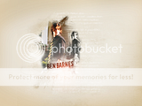
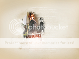
I was making a very rare batch of Ben Barnes graphics last night and had the urge to try a wallpaper with this picture. The style is a bit different for me, but I think I liked how it turned out.
EDIT: Several people commented on the 'horn' sticking out of Ben's head in the original wallie, and I confess that I didn't even notice it when I made it.  Here's a version without it.
Comments and CC very welcomed, and appreciated! 
--- flambeau
President of the Manalive Conspiracy
Founder of Team Hoodie
Icon by me
I like it, Flam! Way to branch out in styles. Just, what is the horn thing sticking out of his head? Was that part of the picture?
Nice job!
"Let the music cast its spell,
give the atmosphere a chance.
Simply follow where I lead;
let me teach you how to dance."
I think the "horn thing sticking out of his head" is just brushwork..... meant as a border.
Having two of him is a little odd, and i can't read the words....
Over all i like it though! the brushwork and blending are good....
signature by Beginte
ooh! I like it! The "horn" as everyone says, looks like hair to me! Almost like he played with hair gel!  I love it! Very creative!
  You are very talented
Avie by:MissAdventure
siggy by:LucyP0104

Caspian + Lilliandil
"Love NEVER fails"
That looks absolutely terrific! Wonderful job! I applaud you!
That was always something I had trouble with, making blends look effortless.
And I could be wrong Lilliandil, but I don't think you're supposed to be able to read all of the words. Sometimes it's just used as to have something there and it looks good. As I say though, I could be wrong, in which case, I have nothing much to say. 

Even to your old age and gray hairs
I am He, I am He who will sustain you.
I have made you and I will carry you;
I will sustain you and I will rescue you.
- Isaiah 46:4
That's pretty flambeau! I love it!  I also love the fonts!
Long Live King Caspian & Queen Liliandil Forever!
Jill+Tirian! Let there be Jilrian!
Very original and creative....very nice work! 
"We have nothing if not belief"
Lovely work, flambeau! I've always liked those pictures of Ben from that photoshoot and really like the layout of this wallpaper. The doubled, almost shadow B&W effect of the same picture is great, particularly since Ben is turning to look backwards. The coloring on the main shot is nice too...with his face and hair having a more redish appearance. It works to make the image stand out from the background. The blending of course, as well as the incorporation of the textures that merge with the background, is flawless. I particularly love the 'splash & swirlyish' fade out texture you used right around Ben's photos! Amazing!  And last but not least the text texture you used in the background adds a nice touch to the whole image. What is the text you used for Bens' name? I believe I might have it, but I'm just curious. Overall, I love the light and carefree feel that you created in this wallie. For me, it emphasizes the original idea of the photoshoot...preppy young man, walking down a ritzy street!

We have nothing, if not belief.
—C.S. Lewis
An absolutely cool wallpaper! I love the layout, the background color, and the effect of 'visual echo' by the doubled picture, the way it plays along with him looking back. And I've always adored the pictures from this photoshoot, for some reason they're very appealing and pleasant to look at. I like the summer stroll feeling of the wallpaper, corresponding with the theme of the original photo. Great job! 
I've seen the movie 9 times!!! (PC)
I've seen the movie 7 times!!! (VoDT) And loved it!
Proud member of the C+S club
Av & sig by me
oh wow, really cool I love it (love Ben's striped tie  ) it's really amazing
always be humble and kind
Wow flambeau, quite the work! Great job on that!
--Benjamin
Avvie By Flambeau Sig by Ithilwen
Team Hoodie!!
Thank you all for the comments! 
Just, what is the horn thing sticking out of his head? Was that part of the picture?
*cough* Uh, nope. That was just an accident from one of the brushes I used on the wallpaper, and I didn't even notice it until I saw your post.  I've fixed it now, and hope that it looks better.
i can't read the words....
Well, as long as you can read his name, then you should be doing fine. The rest of the text is just random tiny text, meant as a design element, and you're not supposed to be able to read it.
Thank you, Lady Lilliandil! 
And I could be wrong Lilliandil, but I don't think you're supposed to be able to read all of the words. Sometimes it's just used as to have something there and it looks good. As I say though, I could be wrong, in which case, I have nothing much to say.
You are correct. Thank you for the comment! 
Thank you, Damsel and greenbird! 
What is the text you used for Bens' name?
I believe that it's called 'Downcome', but I'm not positive about that. You should be able to find it at dafont.com.
And thank you for your awesome feedback! 
I love the layout, the background color, and the effect of 'visual echo' by the doubled picture, the way it plays along with him looking back.
That is a very neat way of putting it! The 'visual echo' (love that phrase!) was something that just kind of happened as I was toying with it, and I'm so glad that you like it! 
And thank you wild rose and Ben! 
--- flambeau
President of the Manalive Conspiracy
Founder of Team Hoodie
Icon by me

