Ugg. Its not very good. My greatest worry is that people who know nothing or very little about Narnia (casual fans maybe) will look at the poster and say, "That looks cheap and uninteresting. I'm not watching that."
How is this going to attract people to the movie? It isn't professional at all. It doesn't look like a big movie studio made that; it looks like it was made by an ammature.
Lucy still looks odd to me. Dragon Eustace looks awful (I know his trailer shots look ok, but how is this going to attract ppl to the movie.) Aslan looks like cartoon of a wild animal; I see no soul in him.
I agree with Narnianerd; Reep just saw a piece of cheese 

Signature by daughter of the King; Avatar by Adeona
-Thanks :]
Keeper of the Secret Magic
I know if I saw it I would look into it, it looks very fun, exiting and adventurous, although it does look a little cheap.
I still like the LWW poster te best. Probably because I was so excited for the first Narnia movie and the poster made me even more excited; it brings back old memories.

Signature by daughter of the King; Avatar by Adeona
-Thanks :]
Keeper of the Secret Magic
I found on IMDB an poster that, while similar to this, has a much better background and lighting and looks more well made.
http://www.imdb.com/media/rm1952941568/tt0980970
Winter Is Coming

That is the UK Quad poster for the movie (cinemas in the UK traditionally show movie posters in a landscape-format design known as a "Quad" rather than the usual portrait-format "One Sheet" design). I don't believe there is any difference to the lighting, composition, or general photoshopping on that poster, besides the fact that the main details are smaller in the overall context of the poster and of the image size, and thus everything doesn't look so vivid and in-your-face as it does on the full-size, high-res, normal poster.
Still, it just looks a lot better.
Winter Is Coming

Yes it does look better. I agree, its probably the same thing but landscape format does make it look better.

Signature by daughter of the King; Avatar by Adeona
-Thanks :]
Keeper of the Secret Magic
I like the one on page 1 better. it is much more bright and vibrant, not nearly as dark.
Thats the problem. Its too bright and it makes the images looks cheaper. The other poster is darker and it makes the film look more mature as well.
Winter Is Coming

I absolutely love this poster!!!!!!!!!! I haven't read through all the pages so forgive me if this has been stated but, Dragon Eustace reminds me of a gremlin, somehow.
http://blogs.the217.com/thelowdown/file ... mlins2.JPG
He looks better in the trailer, though. He's not the cutest dragon I've ever seen, but they have to get the point across that being a dragon is a terrible punishment. So many people are drawn to them these days that they may not think being a dragon is all that bad. 

He does look better in the trailer so I'm not that worried about the dragon. I just can't believe that the production team would realize they have a chance to put a dragon in the movie and make a lousy one.
On the poster he looks like a cross between a dragon and a bug to me.

Signature by daughter of the King; Avatar by Adeona
-Thanks :]
Keeper of the Secret Magic
The dragon looks really good in the trailer, he is just in a really weird position
It isn't terrible though I'm not amazed by it. The dragon looks really weird.
I agree, the dragon design is subpar. For me its the feet.....they are too big and the face looks kind of dopey. But it isn't so bad that it will take away from the movie for me.
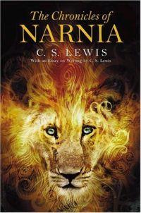
I already mentioned this in the Aslan between the movies thread but the poster Aslan looks a lot like the Aslan on the Harper Collins book covers


http://images.amazon.com/images/P/00071 ... ZZZZZZ.jpg <- SC
"The mountains are calling and I must go, and I will work on while I can, studying incessantly." -John Muir
"Be cunning, and full of tricks, and your people will never be destroyed." -Richard Adams, Watership Down
^ That picture actually remided me of the teaser trailer (the one with just Aslan and Reepicheep.) Well actually it was the otherway around: the teaser trailer reminded me of that picture.
In anycase, I like that picture on the book than the picture of Aslan on the theatrical poster.

Signature by daughter of the King; Avatar by Adeona
-Thanks :]
Keeper of the Secret Magic

