One step closer to the movie...this is so cool! I love it! 
"We have nothing if not belief"
Just had a little look on the Empire magazine website, and found this story which talks about several of the posters at Cannes. Plus they have some more pictures of the VDT poster ...
Yes, the poster does wrap around and the Dawn Treader herself is there!
I've got the news story updated with those pictures as well.  Glad the ship made it on there! The kids look great.
  With Ed, the perspective is off in that shot. With his head being wet, it is obviously from a different shot then the other two. Lucy's a bit too photoshopped in that image.
My first thought was "Lucy is all grown up!"
I like the layout and design overall. And yes, I do like the magic tagline 
Hopefully this banner will make a lot of people very curious about the movie. It sounds so exciting! I re-listened to VDT on audiobook last month- definitely an excellent installment that will make a superb movie.
Yes, the poster does wrap around and the Dawn Treader herself is there!
AHAHAHAHA, For once in my life one of my theories turns out to be correct!!! And yet I was wrong at the same time because it wrapped around the other side. 
EDIT: After looking more closely, it does wrap both sides and I THINK on the left side, it's the Dawn Treader's tail. That's cool. 
Thank you for the update f_k, Starkat and AJAiken! 
Thanks to the better views Georgie looks very grown up now and is prettier then Susan in my opinion. Eustace looks innocent instead of a troublemaker in the picture and Edmund looks to have taken Peter's place and his sword. Though everything does look good and I love the DT on both sides of the banner. Caspian looks as if he's left teenagehood and doesn't look naive in the picture, he looks like the Seafarer he is meant to be. I cannot wait!
Long Live King Caspian & Queen Liliandil Forever!
Jill+Tirian! Let there be Jilrian!
Thank you for the update f_k!
The credit doesn't go to me on this one. Starkat updated the story and I think AJAiken was the first one to find it. 
As for Aslan's eyes and nose, I do think his eyes are a bit bright, probably just to catch attention. You can see some lighting on Aslan's nose if you look closely, so I'm guessing it's the angle (or just higher contrast of the promo image itself).
In regards to Aslan's eyes and nose. I noticed that there was an abundance of red in that image and in Reep's, so I went into photoshop and removed some of the red.
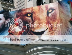
This helps the black be a bit less startling.
DANG!!!
I want one! I mean this is crazy. It kinda reminds me of PC, but I'm also getting LWW marketing style vibes. This is very interesting, I think they're trying to kind of combine both styles of marketing that they used. This could be good.
Anyhow I really like the new shots, that shot of Edmund is very good (and also very reminiscent of the shot of him on the LWW poster).
 avie/sig by me
"The last enemy to be defeated is death." -1 Corinthians 15:26 http://www.youtube.com/user/voldythemoldy http://twitter.com/#!/voldythemoldy1
I have a feeling it probably doesn't wrap around, as doing so would throw off the balance of the banner and make it look a little odd. Then again, I could be very wrong on that.
Obviously I was very wrong on that... 
I'm very glad to see they have indeed included the ship in the banner although, admittedly, it looks a bit odd because of it's proportions next to the actors.
I agree with Kat that they've spliced together several images for the shot of Edmund. His head obviously being one image, his body another and his sword another. The more you stare at it, the stranger it begins to look, but upon a first look (which is likely what most people at the festival will get) it appears fine. His body IS too big for his head though. 
I like the shots of Lucy and Eustace, but I'm not sure I would have arranged them that way. With Edmund being on top, but being smaller then Lucy and Lucy only heaving a head, while Edmund and Eustace both have bodies, it makes for a somewhat awkward composition. Oh well, it's a beautiful banner anyways.
I have no real problems with the other side. Caspian, Aslan and Reepicheep all look fantastic!
This gets me so excited!!!
I'll always be a,
NL101 

Rest in Peace Old Narniaweb
(2003-2009)
This is just totally awesome!!! 
 This banner, just get's me more excited for VOTD! I love the layout of it and to me, all the pictures are really nice!! I didn't know if anyone noticed but the ship, is on both sides of the banner.
  It's kinda hard to see on the side with Caspian, Reep, and Aslan but it's there!! I'm glad they included the ship, though I would have loved it even if they hadn't. Edmund has Rhindon?
  Strange Caspian had Rhindon in they end of PC and I had hoped he's keep it. But I guess we'll wait and see!!
  I just simply love this!!
  Thank you so much for bringing this update to us!!
SAIL ON VOTD!  Return to the magic!! YEAH!!!

Loyal supporter of Caspian/Susan.
NW Family: Aunty Vi, LadyC, Rose, Chloe
Secret Order of the Swoosh.
Keeper of the Secret Magic
L6
I think that the strange coloring and proportions will be make sense once we see the one-sheet poster. In fact, we're probably looking at most of the one-sheet in this banner. I think they probably cut out the individual people/characters and rearranged them for here. 
Edmund doesn't look nearly as weird to me now seeing him from the front. The reason his arm looks sooooo huge is because he's wearing poofy sleeves.  And apparently they're explaining away him holding the blade of the sword because he has a gauntlet on. ....
Perhaps the reason why Edmund has Rhindon is because of the footage we saw of Caspian and Edmund dueling. maybe Caspian had let Edmund use it or Edmund wanted to claim it during the voyage by beating Caspian in the duel. 
Just a guess.

Long Live King Caspian & Queen Liliandil Forever!
Jill+Tirian! Let there be Jilrian!
Perhaps in the movie no one really owns Rhindon, but they pass it to each other as needed? Not that Rhindon ever had any special powers-- but what if they've made it one of the seven swords?
And Aslan's coloring doesn't bother me at all, especially after his milky tone in PC. However if you look at Reep you'll notice that his color is also intensified, and we've seen a picture of him from VDT normal coloring. So I think that Aslan's color in the poster won't be the same as in the movie.
The composition is good until the right side-- Ed's elbow is big and we should see more of Lucy's body along with Ed's and Eustace's, and the Dawn Treader isn't connected but looks random sticking out there.

Quod Erat Demonstrandum
EDIT: After looking more closely, it does wrap both sides and I THINK on the left side, it's the Dawn Treader's tail. That's cool.
I was looking at the left side again and I think it's actually the head because the spiky bit around the neck seems to be there. But it's pretty hard to tell.
I think they all look pretty strange on this poster, but that's normal for movie posters really. I still giggle at LWW's three polar bears, Edmund-head-on-Peter's-body and the random "climbing up a rock face" shot, too.
Lucy P., I agree: the composition is better on the left side.

